There were approximately 1.94 billion websites in the world as of December 2018.
Given the constant increase of internet users around the world, and the fact that more and more businesses are hopping on board the digital train, the competition for getting attention is fiercer than ever.
But luring your market into visiting your website isn’t the only hurdle you’ll face. The bigger challenge is leaving a mark and getting the brand stuck in your audience’s minds.
Since people are more inclined to remember and engage with visual elements, businesses use this to their advantage by keeping their visual brand identity present in their website.
Google’s brand, for example, can easily be identified through its colors.
While communicating your brand to your audience is key, it’s just as important to remember that consistency cannot be achieved if the people crafting your website is just as oblivious to who you truly are as a business.
Design Struggles of a B2B Business
When you’re a B2B business, you’ll know that producing large digital products such as apps and websites require a ton of effort:
- Building the same web products over and over
- Facing development challenges such as inconsistent tooltips, confusing modal dialogs, and competing button styles
- New designers, engineers, and product managers taking months to fully understand how to use the set design language
While ensuring consistency can be challenging on its own, managing design resources to achieve that is another–and that’s the last struggle designers and developers want, but can’t help but face.
When developing a website, your project team will especially struggle when the needed assets are cluttered, and there’s no way of knowing what your brand is all about.
That’s why we’re going to tackle a solution that saves you the time and, ultimately, the money when developing a web product.
What are Design Systems?
Primarily used by designers and developers, design systems are an ecosystem of design components that make up your brand—from visual components like UI patterns and buttons, to guidelines on messaging and the proper usage of your logo.
Think of it as a designer or developer’s nifty organizer for your brand’s design elements, including notes on design processes and how to use its components.
So if you’re looking to ensure brand consistency throughout your website, apps, and other marketing collaterals, a design system makes it easier for users to reuse and combine different brand components to create a new web product, all while keeping its visual identity intact.
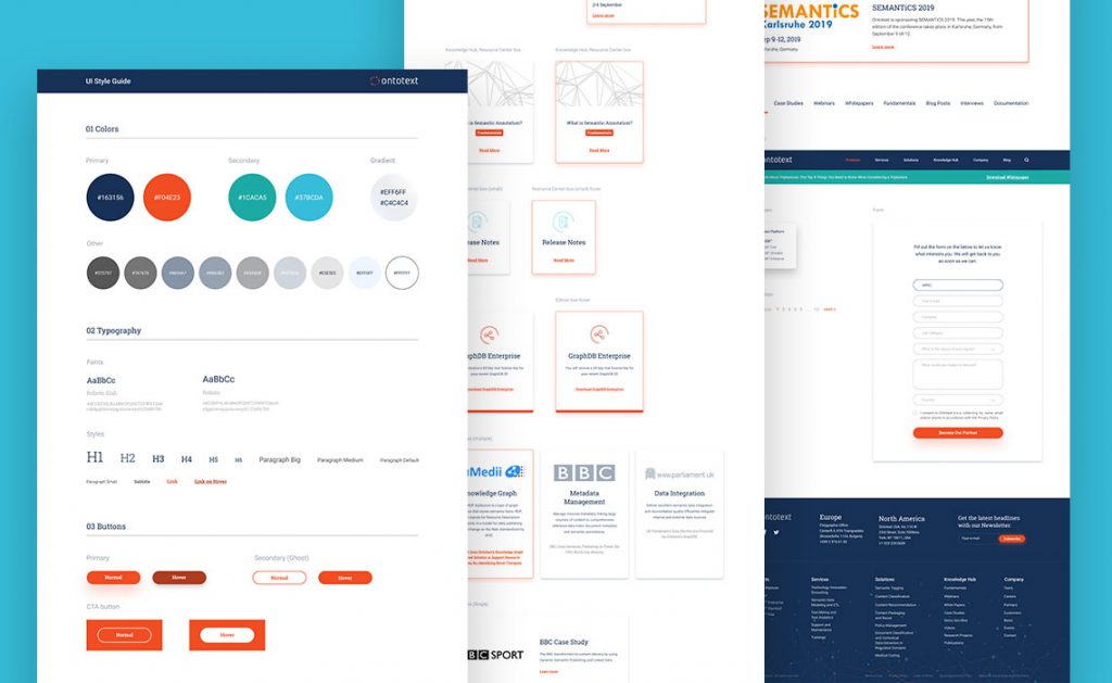
Website Styleguides are the foundation for Design systems. Example by Ontotext
As simple as it sounds, a lot of people still confuse a design system for its components. So we’re listing down what makes up a Design System and how they relate to each other.
UI Kits
When building a Design System, it’s key to understand that it’s not all about the style components. The first thing you need to work on is the functionality. After all, styles fade but functionality will always stay.
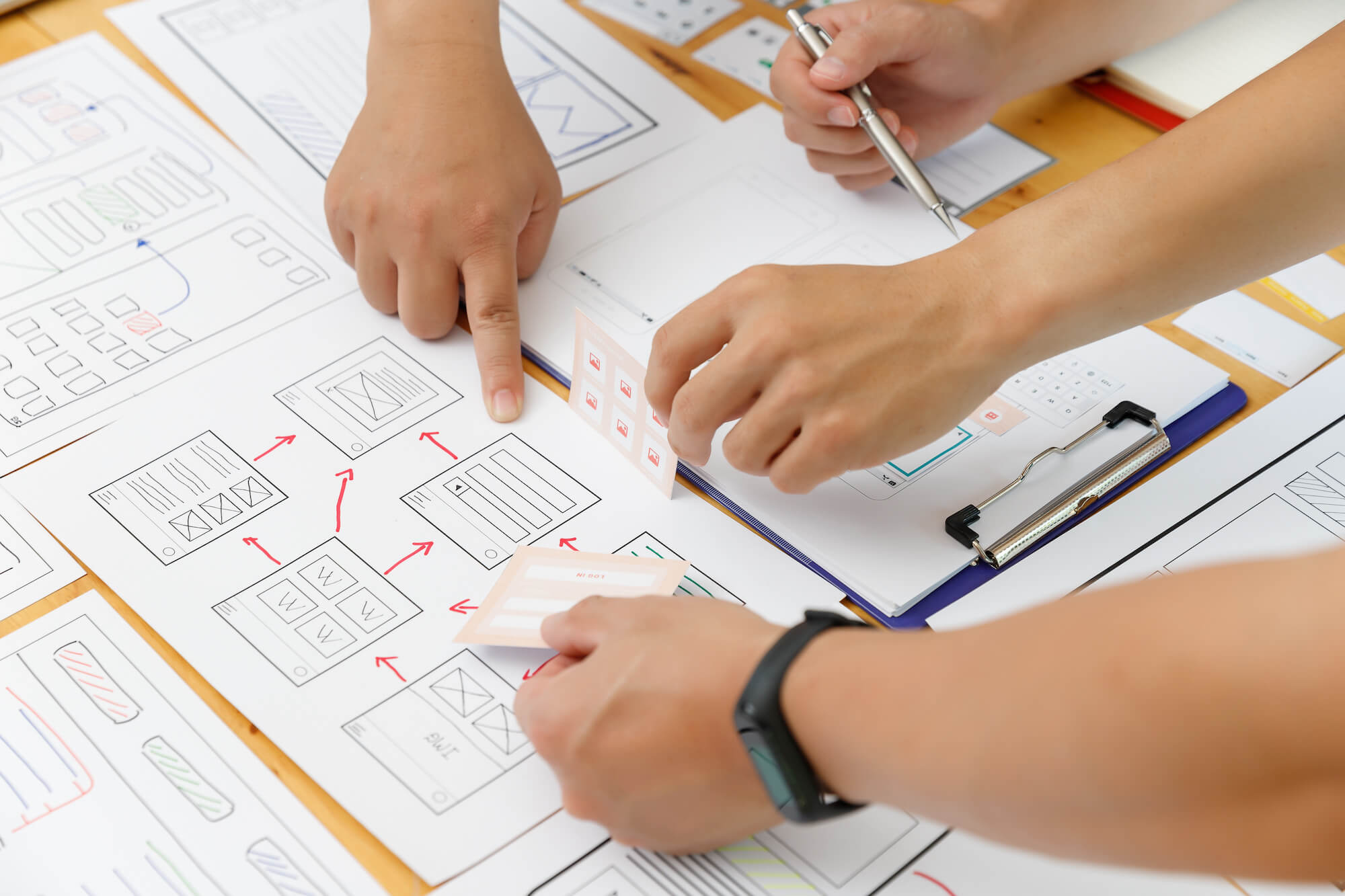
The first component we’ll cover are User interface (UI) Kits. These are composed of graphic files (PSD, XD, Figma, or any other format) and other resources for building user interfaces. Useful for front-end developers, these elements are necessary to create your user interface layout—from conveying meaning to providing functionality to your website or app.
Some popular UI design tools to help you get started with developing your UI kit are AdobeXD, Sketch, and Figma—all of which makes it painless to build and manage complex interfaces.
Sample components: buttons, icons, checkboxes, alert notifications
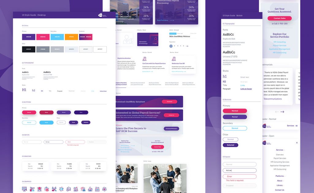
NGA HR utilized a design system for their website redesign.
Pattern Libraries
Even with a UI Kit available, developing your web product can still be a bit taxing.
When it comes to constantly looking for UI components that are commonly used from multiple sources and put them together every single time, Pattern Libraries do the trick.
Pattern libraries are a collection of UI elements that solve common design problems. When it comes to building a landing page, for example, pattern libraries can include a particular page layout that works best with your goal.
Sample components: navigation, carousels, social media features, slideshows
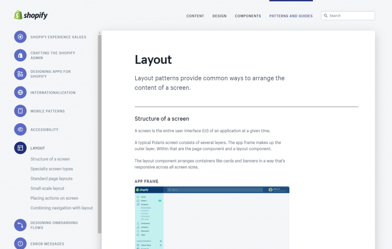
Shopify Polaris offers an extensive guide on reusable UI components.
Brand Books
While having all your UI components organized and well incorporated to your Design System, it may render useless when, in production, you can’t use it appropriately.
That’s why it’s necessary to be just as aware with how each element should be used.
Also dubbed as your brand bible, a brand book holds all the dos and don’ts you need to know in implementing brand visuals across all your platforms, ultimately ensuring that your brand’s identity throughout your business is appropriately presented.
Sample components: proper usage of logos, choosing the appropriate font, imagery, tone of voice
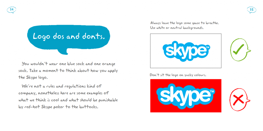
Skype presents their branding guidelines with engaging illustrations and witty copy.
Style Guides
Now that your Design System has documented everything needed to make every product functional, it’s time to focus on the style of your brand.
A style guide is a collection of standards for various branding elements and design patterns of a site or application. With this, front-end developers can find the essential design elements faster, ultimately making the implementation process a more efficient experience.
Sample components: color palette codes, logo, typography
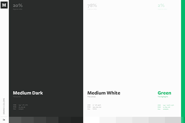
Medium ensures their sleek and minimal branding is manifested on their style guide.
When it comes to ultimately piecing all your design elements together, it helps to have a management tool that makes collaboration easier between your design system users.
A popular tool for Design System Management is InVision DSM, which provides a shared structure for your design system components.
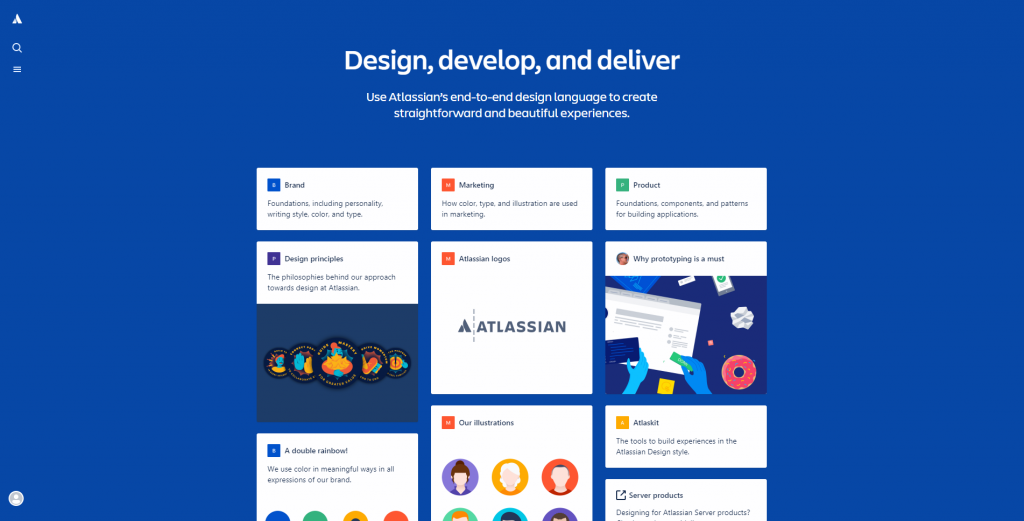
Atlassian increases design process efficiency through their design guide.
What’s in it for you?
Putting together all your design components in a single source makes website development a less taxing process. But that’s not the only benefit design systems offer.
It provides design consistency for easier recall and better user experience. Design systems make it is easy to achieve brand consistency across all platforms. Not only can you be assured that developers and designers are able to present your brand accordingly, you can also sleep at night knowing that your consumers are more likely to remember your brand.
It accelerates design and development process. Going back and forth from designer to developer just to get that one component can be very counterproductive. Design systems simplify your communications and development process, minimize the time spent on quality check, and more.
It allows for a shared understanding of the brand. Design systems eliminate brand inconsistencies in your web product. By ensuring that guidelines and principles are set from the start, your design process will no longer be interfered with assumptions and objections since all users agree to what’s been set.
It is scalable to your growth. As your business progresses, so does your brand. Design systems can be constantly updated so that your brand identity resonates not just with your existing market, but also with the new ones.
Common Myths Debunked
Design Systems are just a UI Kit.
Design systems can just be a UI kit, until your brand identity expands due to business growth. That’s why when you need to reconsider creating a branding kit, it’s just as necessary to know what your business truly needs out of it.
Design Systems are an unchangeable source of truth
You may think that having a design system restricts your brand from improvement. However, change is necessary for progress. And if this myth about design systems is true, none of the biggest brands’ logos, websites, and other assets would look the way they do now.
In truth, the challenge lies in producing clearer design principles and guidelines that are future-proof and adaptable to change.
Executive-level support is necessary to start building a Design System
Sure, it could be easier to build your design system when you’ve got the management to support you financially. However, this isn’t exactly a requirement to get started.
The truth is that there are several ways to start a design system without having to get buy-in. If you just have people with enough passion and time to pull it off, it could be a slow, but ultimately effective approach.
Getting Started
So you’ve already discovered your need for a Design System. What’s next for your business?
A lot.
But here are a number of things you ought to have set out for starters.
Run an Audit
The first thing you need to do is unearth all the branding assets you currently have. Find out what you have and what you don’t. In doing so, you’ll be able to map out your branding asset needs and what your game plan should be in order to develop them.
Identify your goals for building a design system
Based on your audit, you will have had a solid understanding of where your business stands in terms of brand strength. With that in mind, you can set goals to guide you through the entire design system development.
Prioritize and plot everything on a timeline
Create a timeline for your design system development according to your goals. It’s best practice to prioritize components according to how often it would be used than others. That way, it can quickly be implemented and used for your next web project.
Build a communication plan
When you start building your Design Systems, maintaining constant communication with your team makes it easier to understand and simplify the process. Not only that, providing constant feedback can shape the team to truly have a unified understanding of what your brand is and how the design system works.
Stay committed
It could be hard to maintain a steady progress on your design system, especially in a dynamic work environment where it’s easy to switch priorities and leave tasks in a pile of other unfinished projects.
That’s why commitment is key. It doesn’t matter how big of an improvement is made or how many people are working on it, for as long as there is constant progress in your design system development.
Once you lose momentum, your dreams of a seamless and consistent brand may go do the drain, indefinitely.
Final Notes
When you want to build a strong brand for your business, being clear-cut about your messaging makes all the difference. In terms of design, a consistent brand increases the chances of your product being remembered by your audience the way you want them to see you.
If you truly want value for your money all while keeping your brand consistent in every project development, look at your design processes as a whole. Providing a better experience for your designers, developers, and engineers makes all the difference.
You’ll know that you’re making a big impact, no matter how far into the development process you’re in.


