Case Study
Creating an online presence for private offices and shared workspaces provider Clockwise

Client
Clockwise is a UK-based company providing working space for companies in the form of serviced offices and co-working spaces. In contrast to most similar companies, Clockwise is breaking the model by offering its clients the ability to rent only on monthly basis which is in contrast to the competitors who are offering an yearly or half-yearly memberships. Their first building was released in the beginning of 2017 and it is located in a top location in Glasgow, Scotland.
Challenge
As a new company in the industry, Clockwise had to show off their different and unique model for renting offices, which is one of their main advantages compared to their competitors. Clockwise needed to build a “co-working” community by using their website, so they needed a fresh and cool look, but at the same time address and resolve the main pains of their potential customers, which are searching for a new working space. It was important as well, to integrate the website with their co-working space management tool – Office RnD, in order to keep all current and future customers in a single place.
Solution
Since the company is brand new, we’ve decided that one of the main goals of the project is to attract new visitors and build a “co-working” community. Our competitive research has shown that this is one of the most important things, when building a shared office. This is why we have created a website, which was optimized to drive traffic from search engines and provide a friendly user experience that pushes the visitors towards the desired goal.
Discovery
During the discovery phase, we started with a brainstorming session with the client. The goal was to generate as much ideas for the new website as possible, and clearly define what should be achieved with the project and how we will track success.
Prototype
The approach when redesigning a website versus creating a completely new website is very different. When creating a new website, much more time should be spent much during the prototyping phase, as all ideas generated during the discovery phase need to be prioritized and re-ordered to facilitate the user flows. We’ve spent several weeks working only on prototypes in order to clear out the layout of the website and the most important information which should be shown on each page.

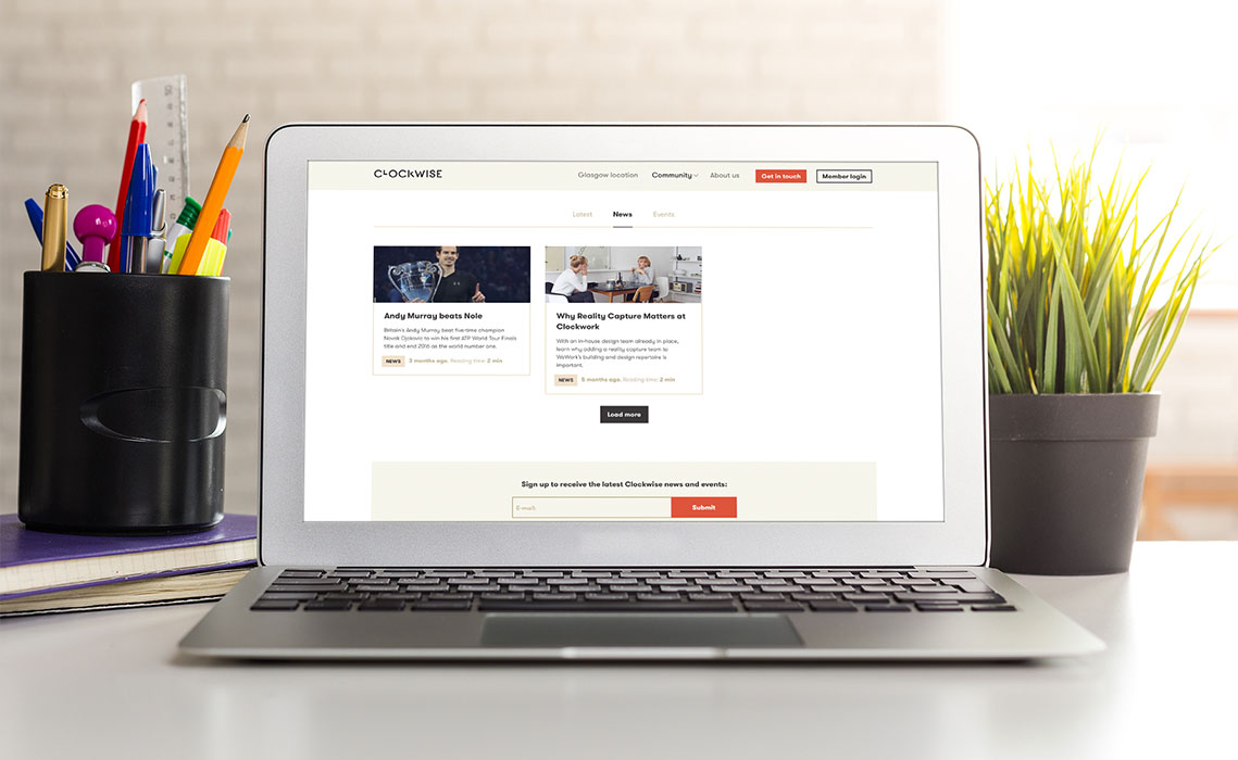
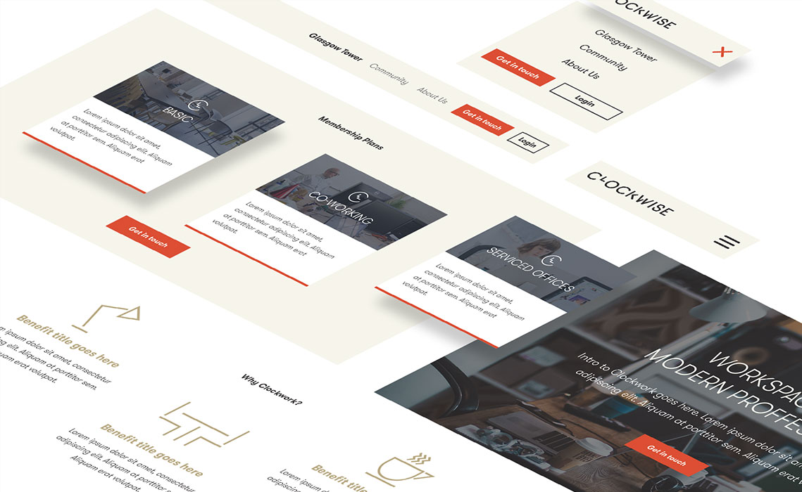
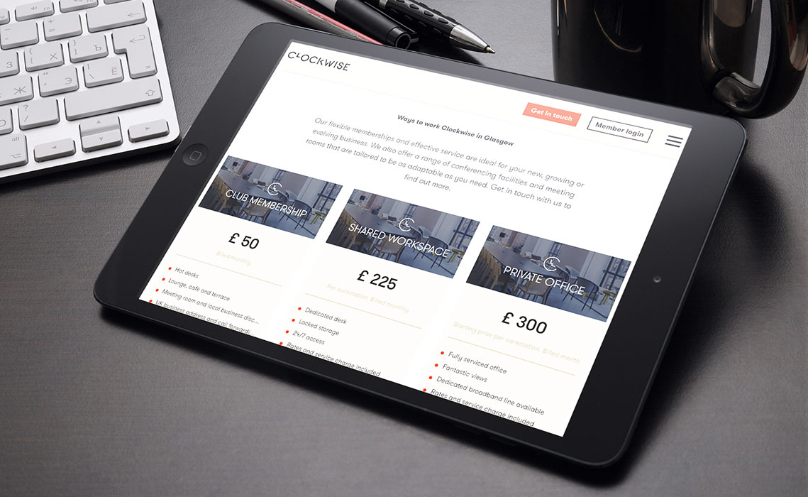
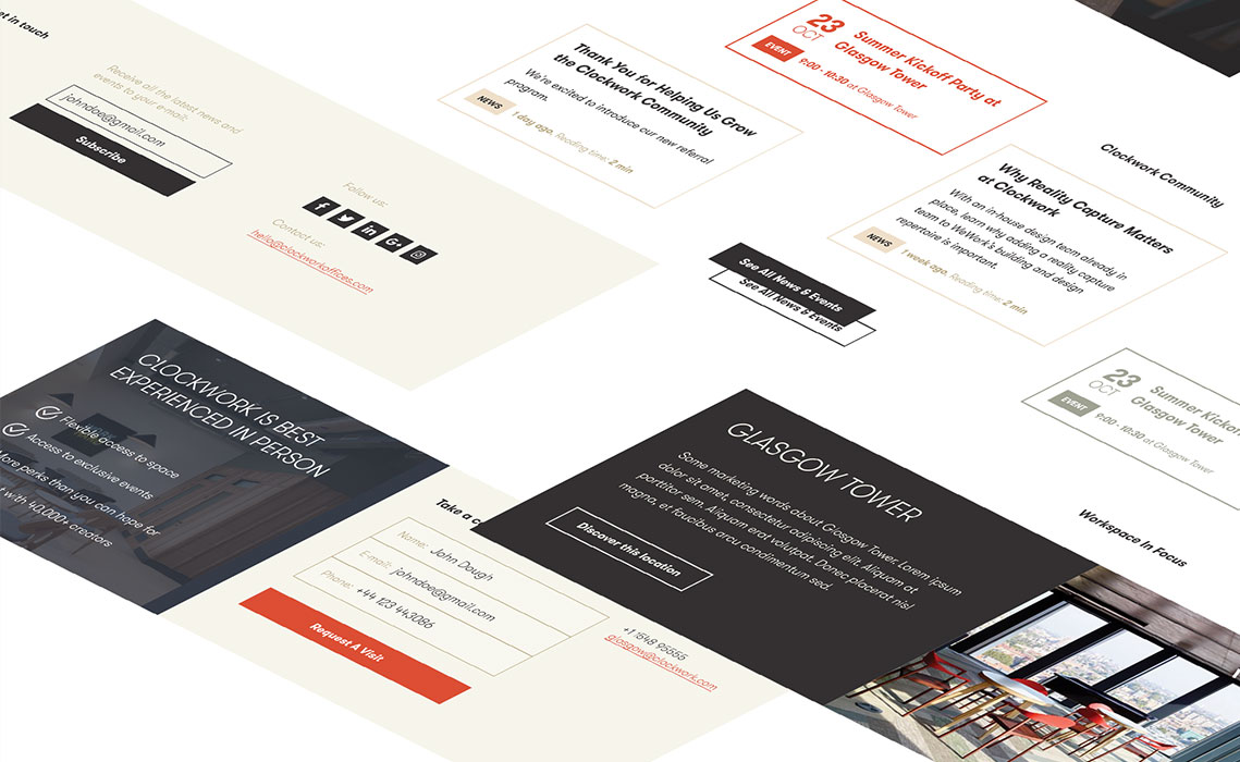
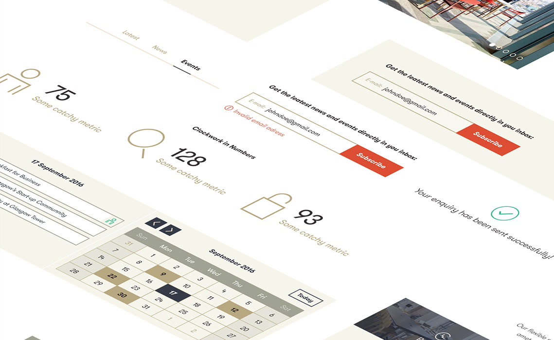
Responsive Website
After we had an agreement for the site structure and the elements on each page, we started the visual design phase for the project. It was quite important to create a modern vision for the website, which matches the look and feel of the building. The UI design was based on previously prepared brand guidelines, which the client provided. As most of the customers of the company are young people, who are primarily using their mobile devices, it was absolutely mandatory to create an intuitive mobile version as well.