Case Study
Brand refresh for a renowned IT service provider on the local market
Client
Since its establishment in 1995, Global Consulting has been one of the oldest and most renowned companies in the Bulgarian IT industry. The company offers a wide specter of IT services and have established strategic partnerships with leading vendors in the IT space such as Informatica, DELL EMC, SAP, Microsoft, SAS, Cisco and Unisys.
Challenge
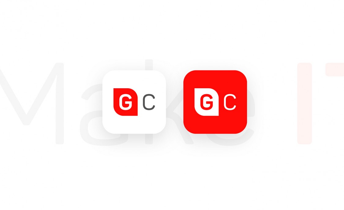
Global Consulting’s branding was every bit the same since the establishment of the company in the 90’s. And although it’s classic look was a recognizable part of the success of the company throughout the years, it was by all means out-dated and failing to catch up with the nature of a technology company that is a leader in their market. The challenge was to refresh the brand in a way that will allow the audience to easily recall its old self, but in the same time capture its high-tech and innovative nature.
Solution
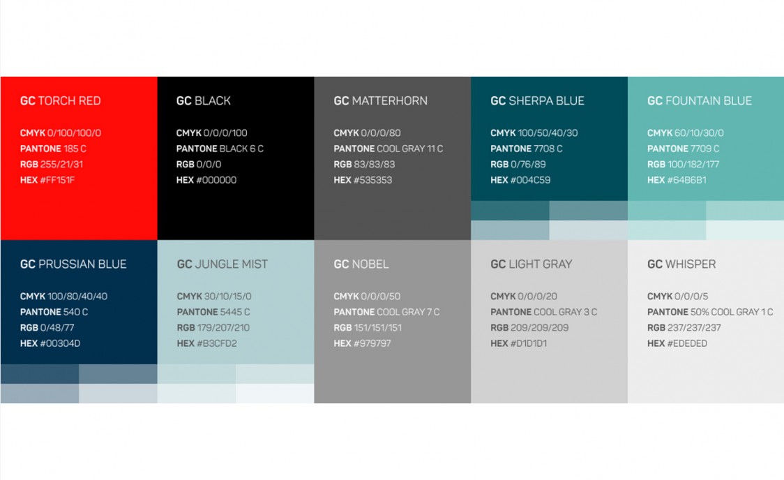
Both teams worked closely, we started with a discussion around which old brand elements should be kept, so we can use them as the foundation of the refreshed visual presence. To make sure that the redesign connects with the old branding, we kept the primary red color but were able to introduce a secondary color palette which supports and enriches the overall visual presence of the company. We then developed a number of customized logo wordmarks that reflected the goals of the company and served as a guideline for the final result.
Branding Components
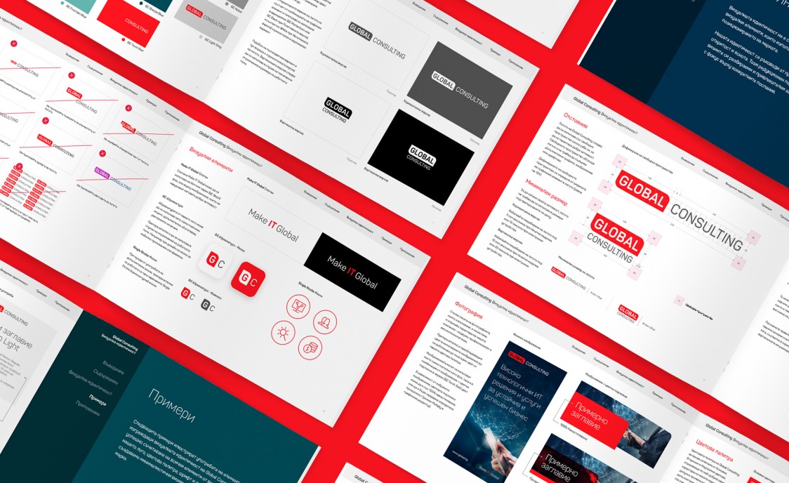
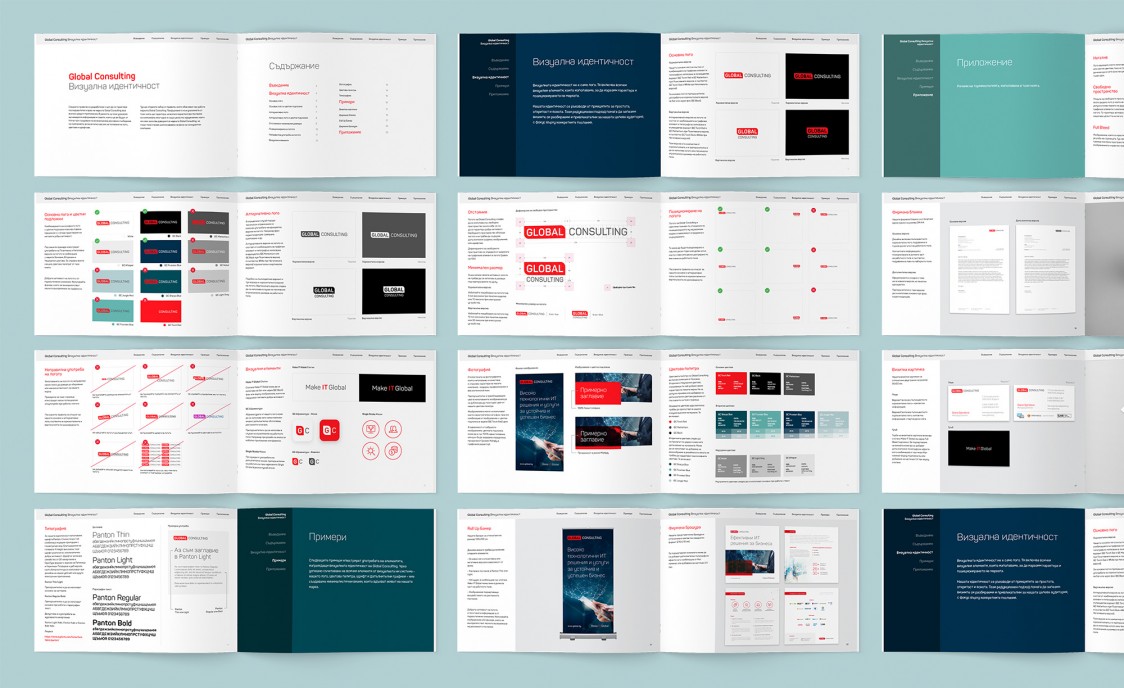
Brand Guidelines
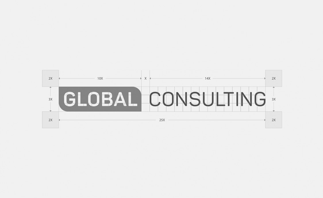
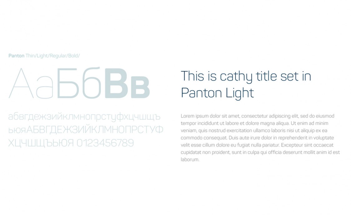
A couple rounds of revisions and stakeholder feedback was required, but finally we nailed down the final direction of the logotype. The next step of the process was the creation of the Brand Guidelines, which include all visual elements and rules that form the new identity. Think suggestions for typography, colour, rules for working with the logotype, icons and imagery.
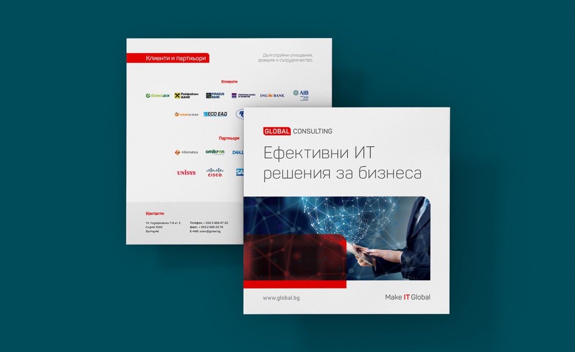
Stationery
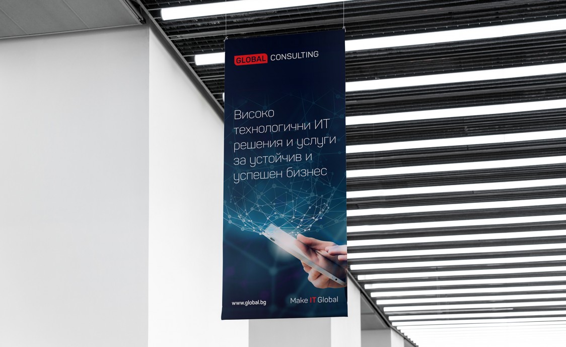
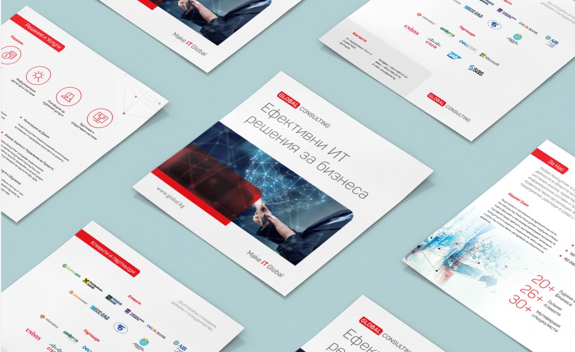
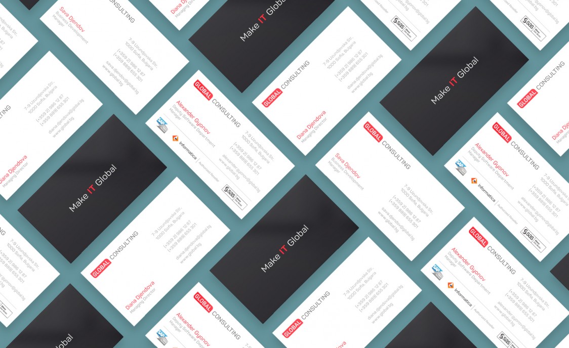
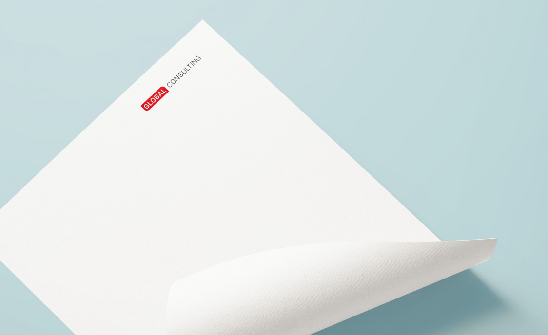
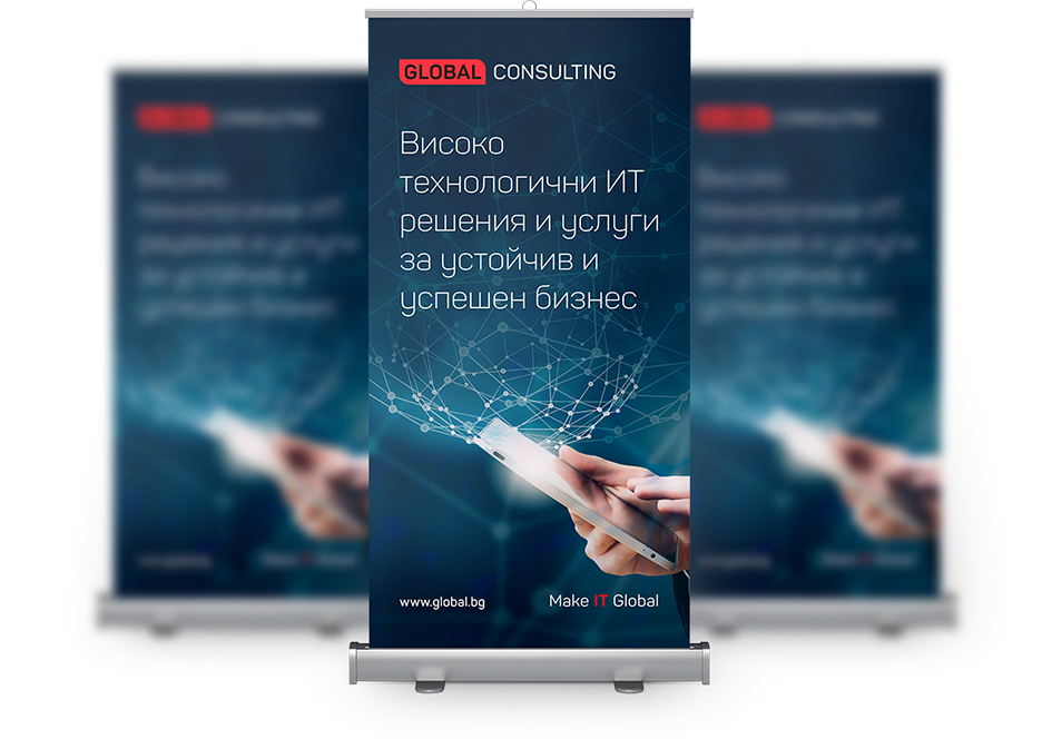
Launching a redesigned brand also begs the refresh of mandatory stationary materials the company uses in everyday communication. New business cards, letterheads, sales brochures and roll-up banners were designed to support the consistency of the brand. Of course, each stationary material followed the visual rules and suggestions that were included in the previously developed brand guidelines.
