Case Study
Crafting a signature real estate branding and online presence
Client
BTL is a Real Estate company that invest in high-end properties, known to deliver results that exceed the highest expectations. Their main focus is the construction of high-class luxury buildings with unique quality, positioned only at premium locations in the capital of Bulgaria – Sofia.
Challenge
Although BTL’s team of investors and architects is responsible for the creation of some of the top residential buildings on the local market, it was clear to the management team of the company that they’re not getting the credit for the premium work done throughout the years. They lacked the branding collateral necessary to promote their brand.
Solution
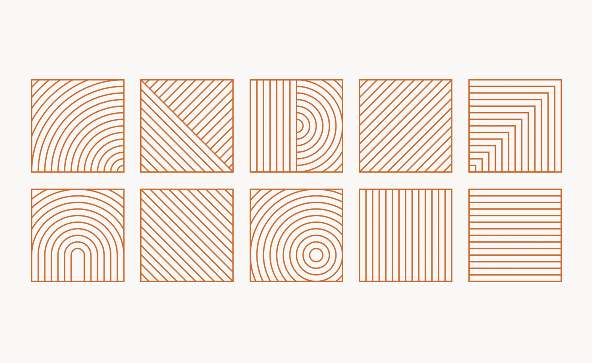
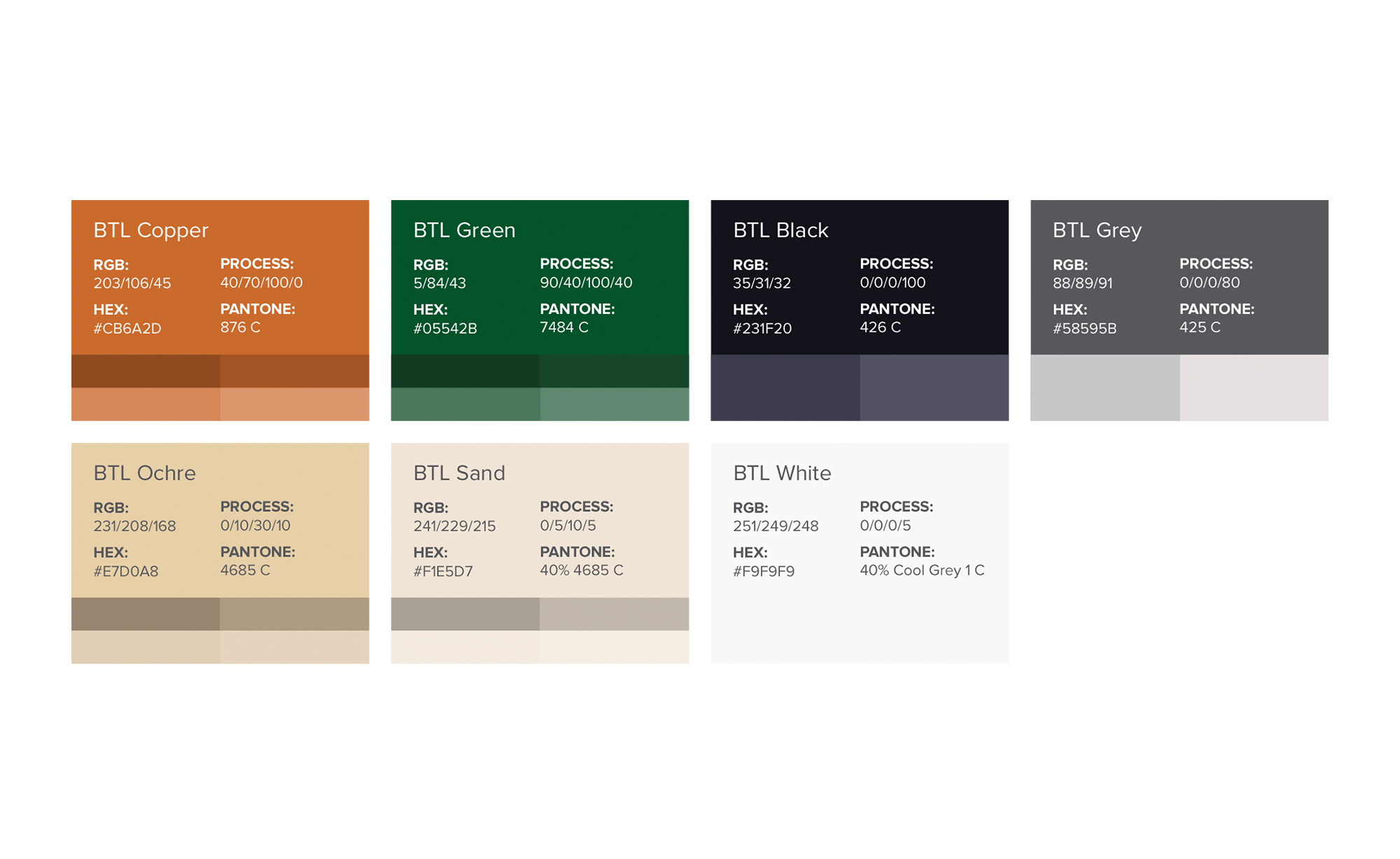
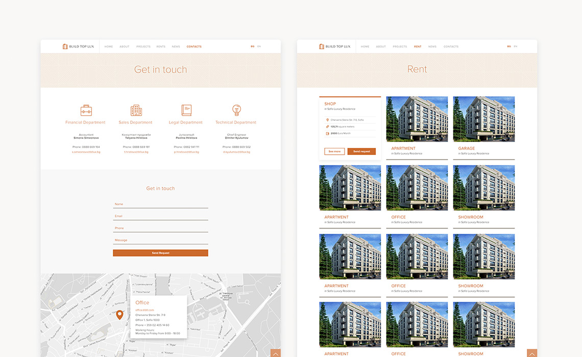
Since the company didn’t have a consistent branding in place, we had to start from scratch and completely revamp their Brand Identity. We crafted a new logo, laid out the graphical and design foundations, created Stationery that is from the highest standard and held multiple collaborations with BTL’s team to make sure that their values will be imbued in every element. A responsive website was also created to further support the promotional activities of the company. The website serves as the active catalog of all portfolio projects, as well as a repository of all properties that are available for rent. Finally, master guideline documents were prepared to ensure that the offline and online presence of BTL will preserve its consistency and actively contribute to the company’s brand awareness.
Branding
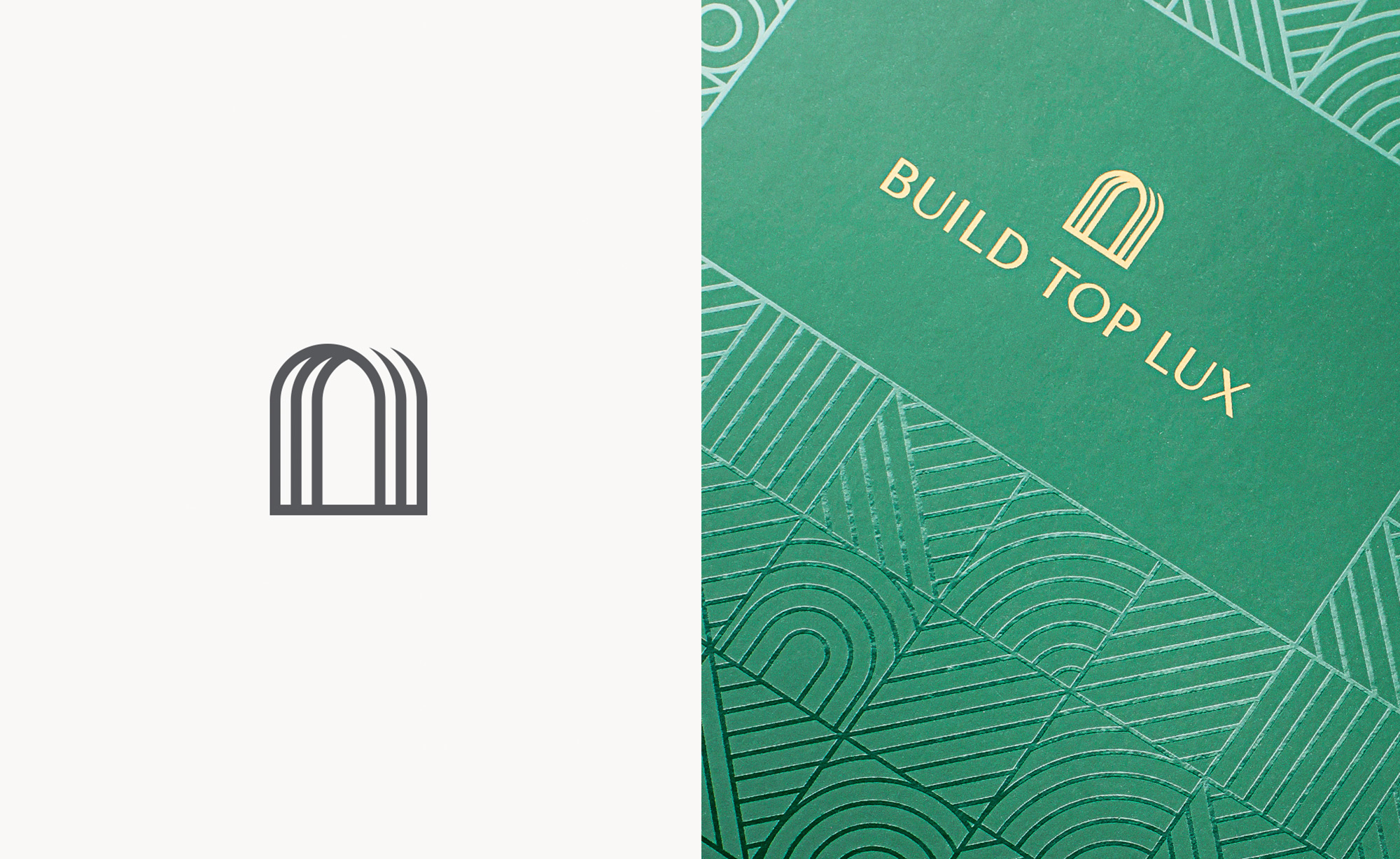
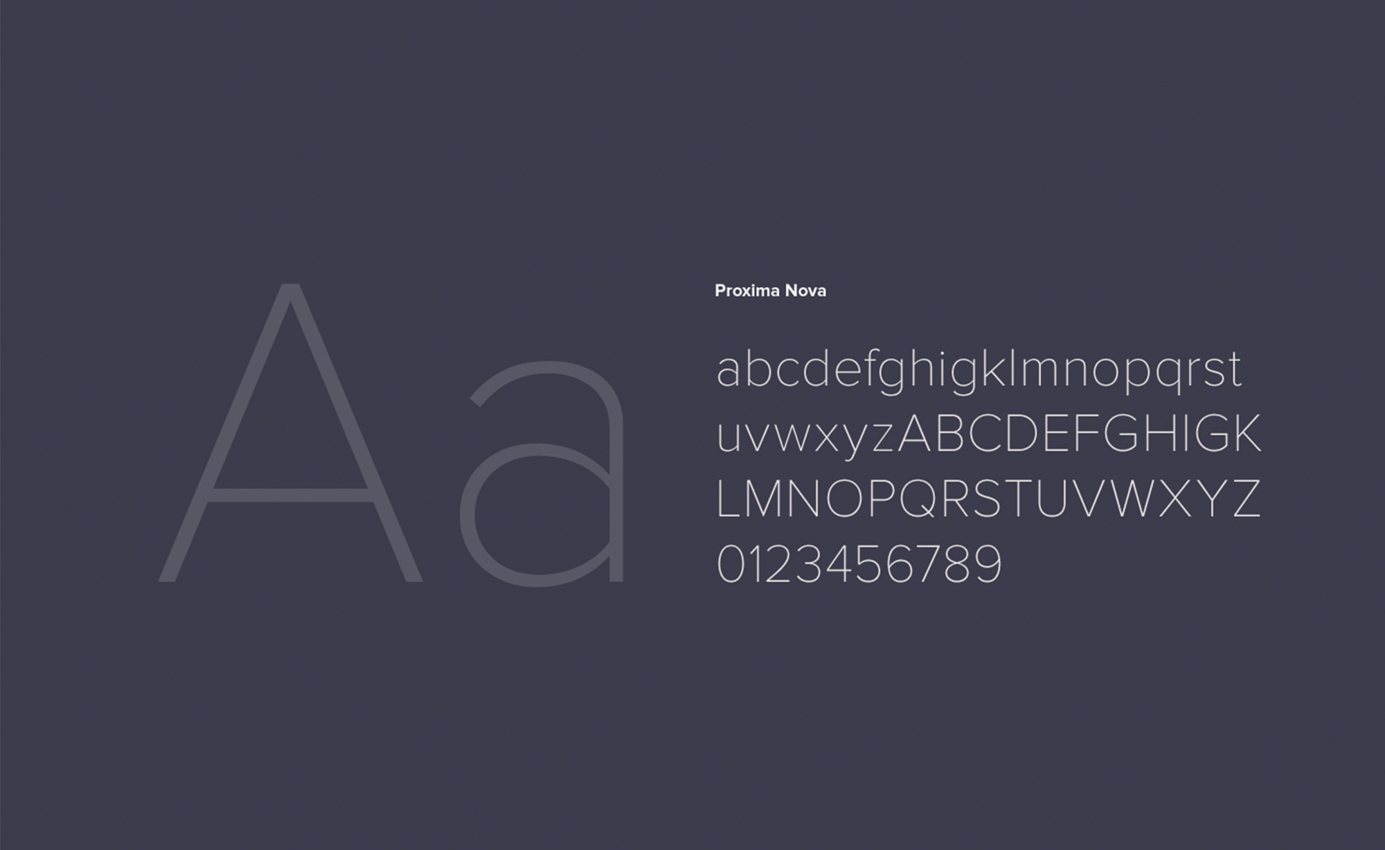
We had a very active logo exploration phase with a ton of great ideas, but as always we had to pick only one of them. Still, our client really clicked with one of the directions we took and confirmed that it represents their business in the best possible way. The main concept behind this direction (the selected Logo Design below) is the illustration of an opened door that symbolizes the search for new possibilities. Once we got the final approval, we went further and developed Primary and Secondary versions of the logotype. With a final touch, we defined harmonious proportions between icon and typography, calculated the clear space areas around the logotype and surrounding graphics, and the minimum logotype sizes.
Stationery Materials
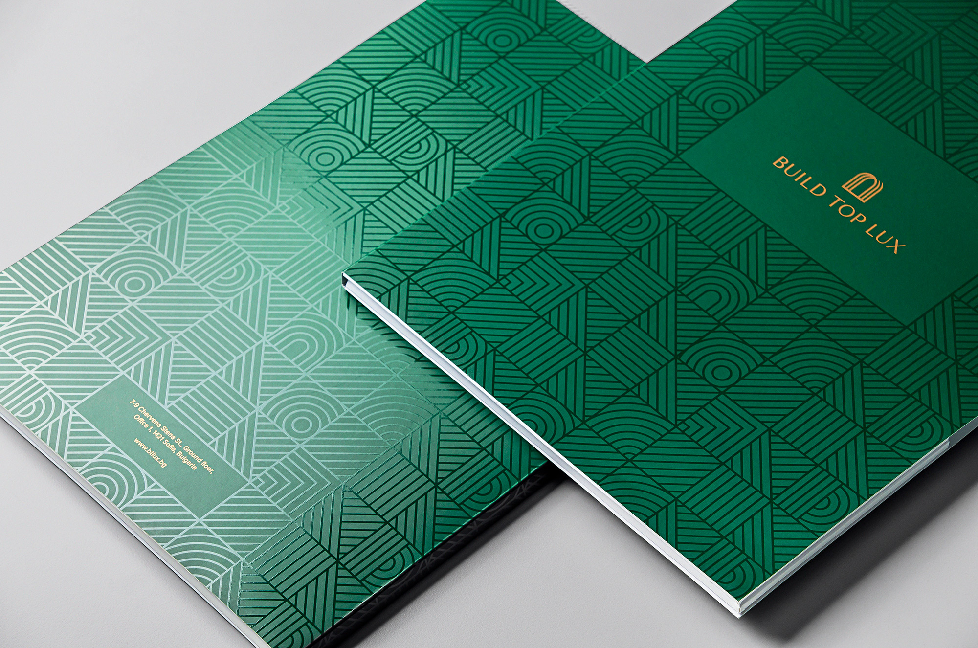
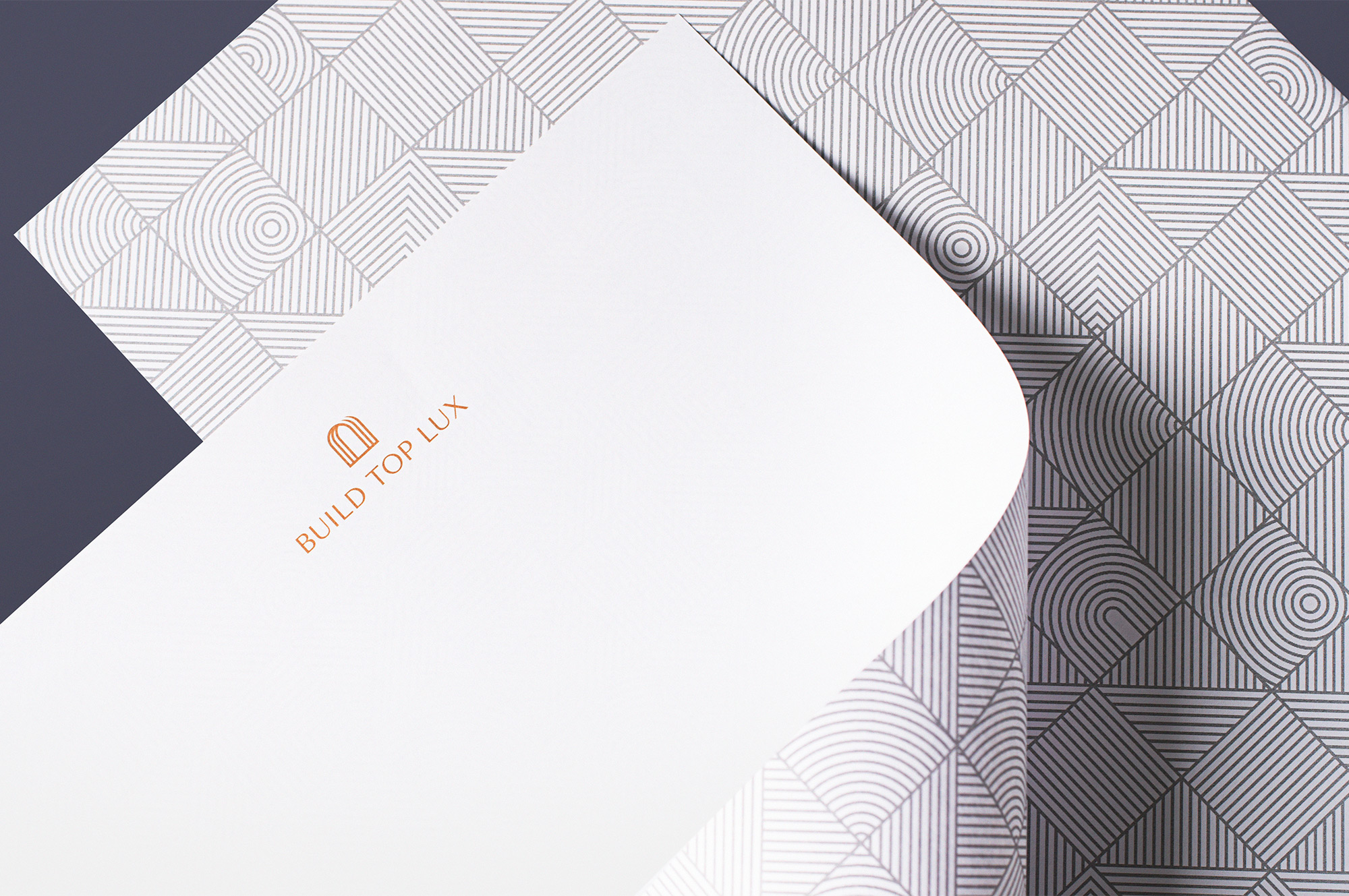
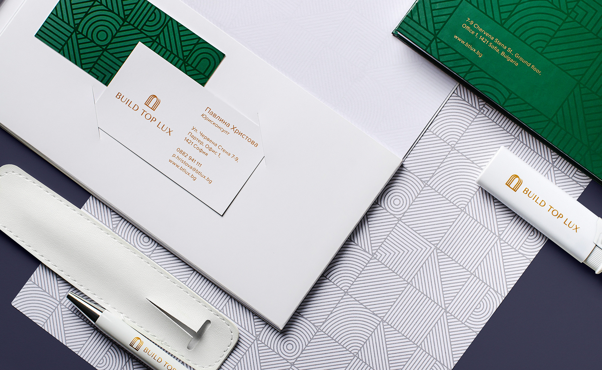
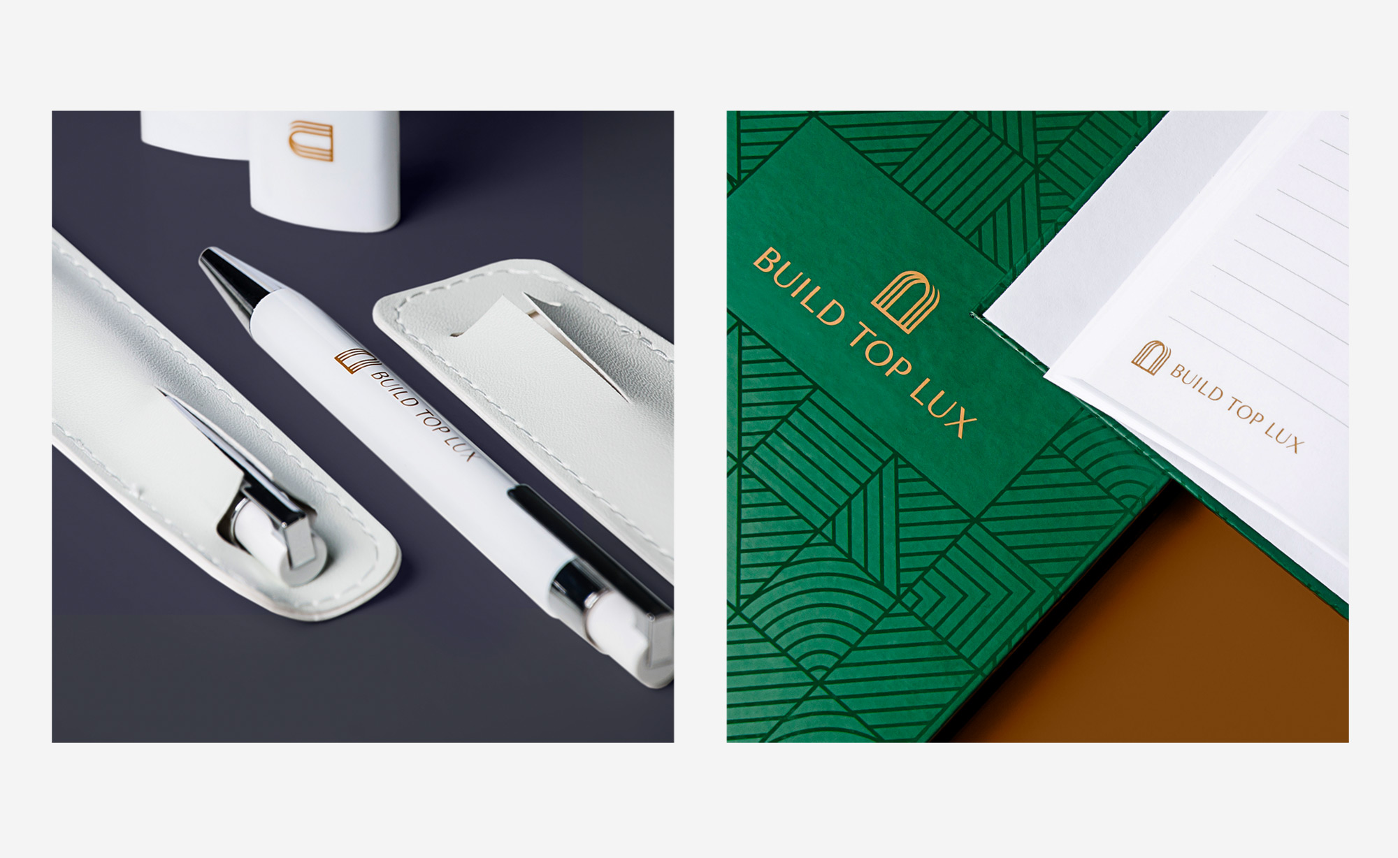
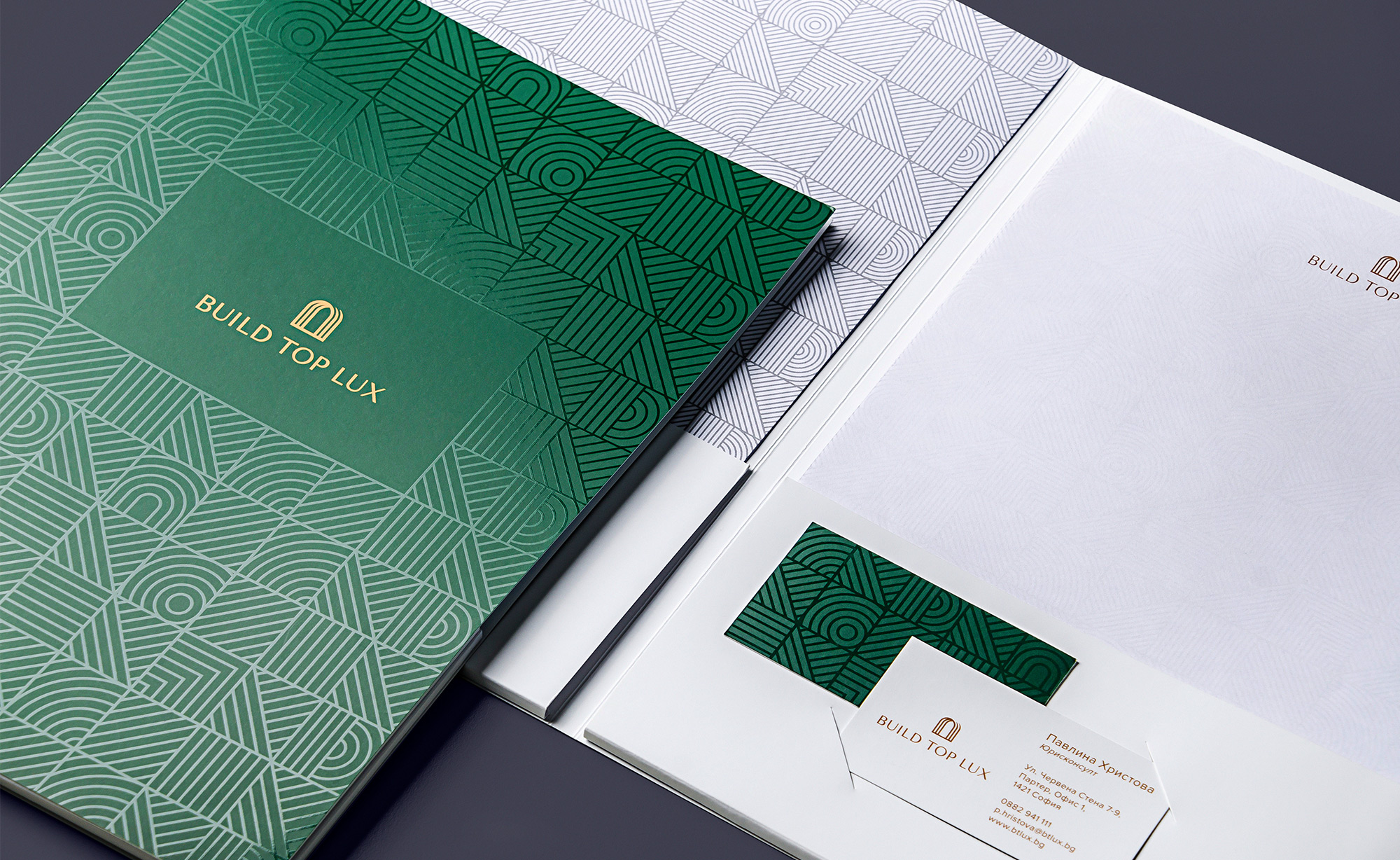
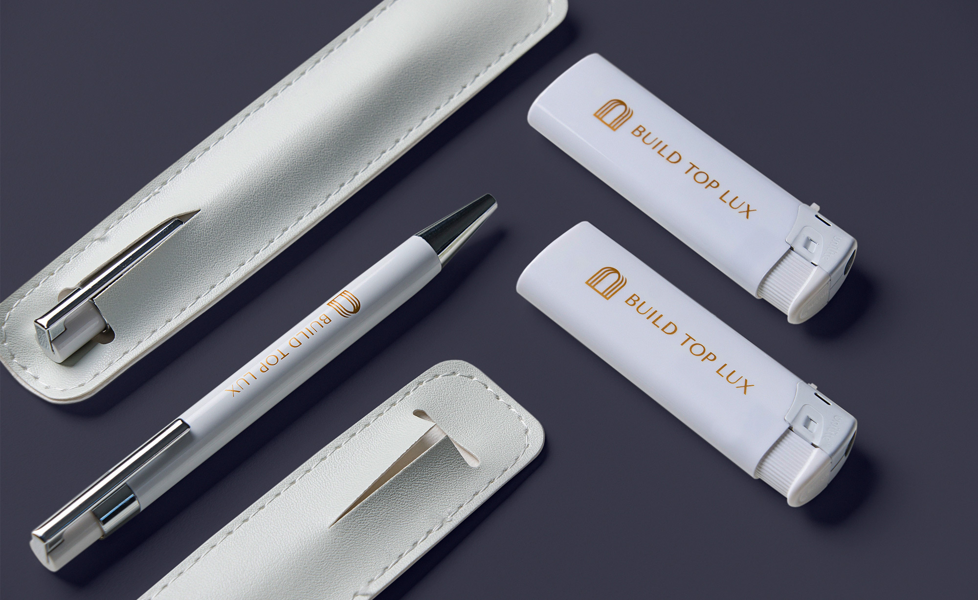
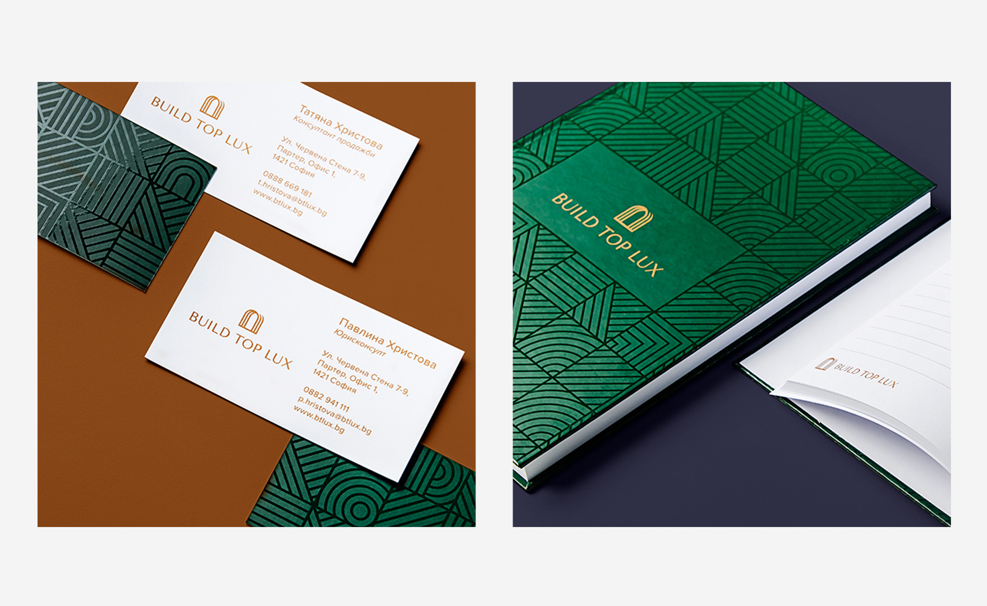
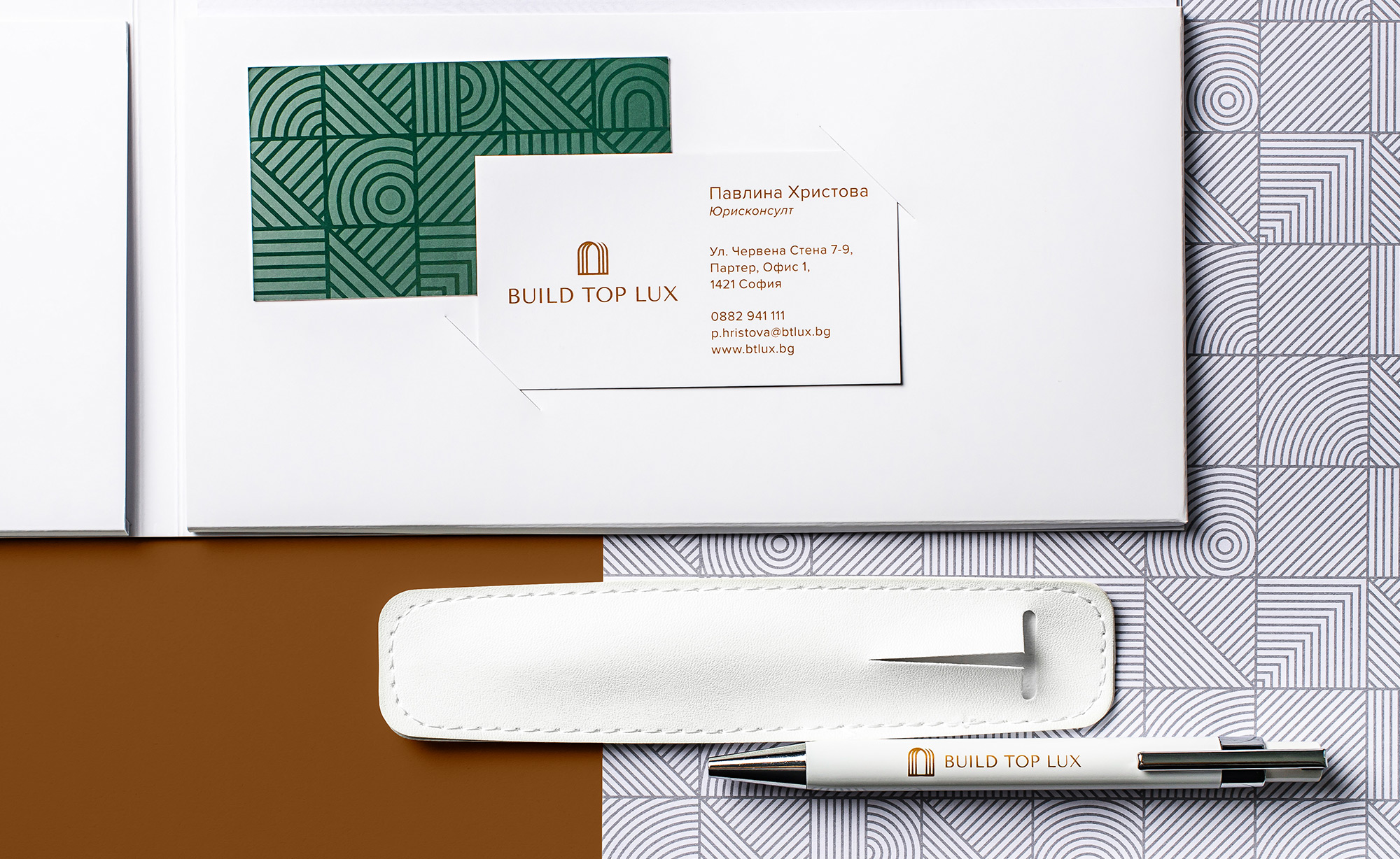
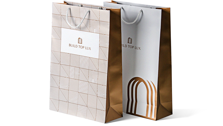
The set of stationery materials we designed include Business Cards, Letterheads, Corporate folders, A5 Notebooks, Paper bags, and other pieces of swag necessary to promote the brand. To make the print materials truly unique, we used a combination of metallic Copper ink and accents from transparent UV varnish finishes applied to the Pattern graphics.
Responsive Website
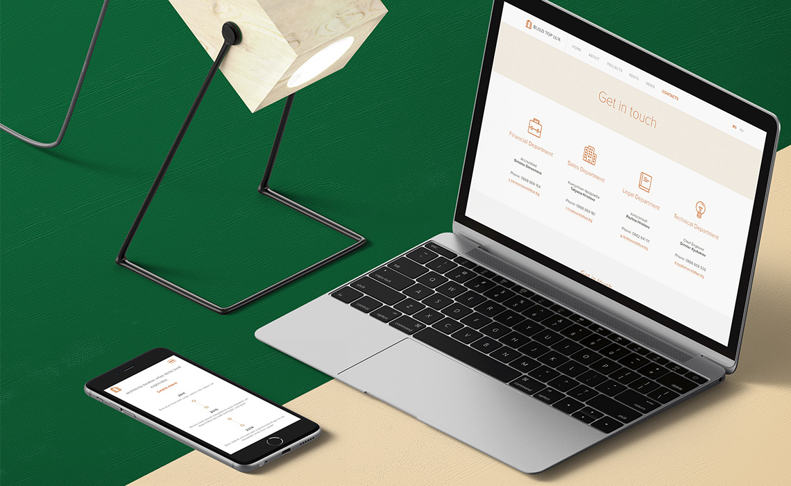
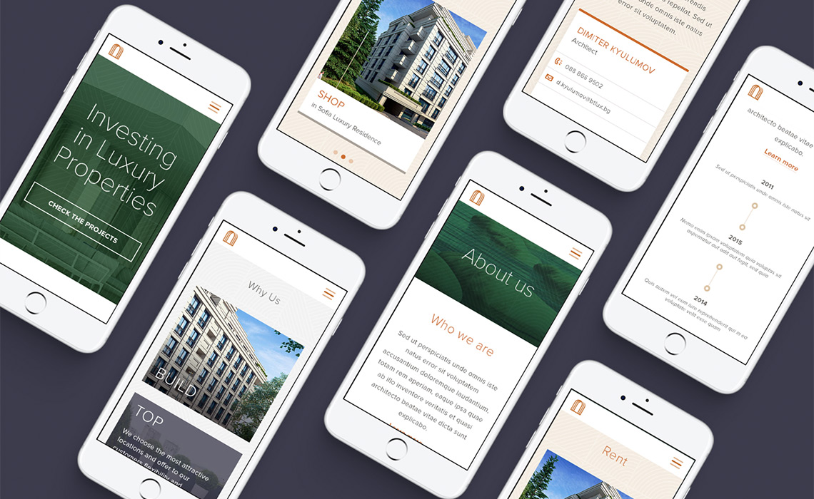
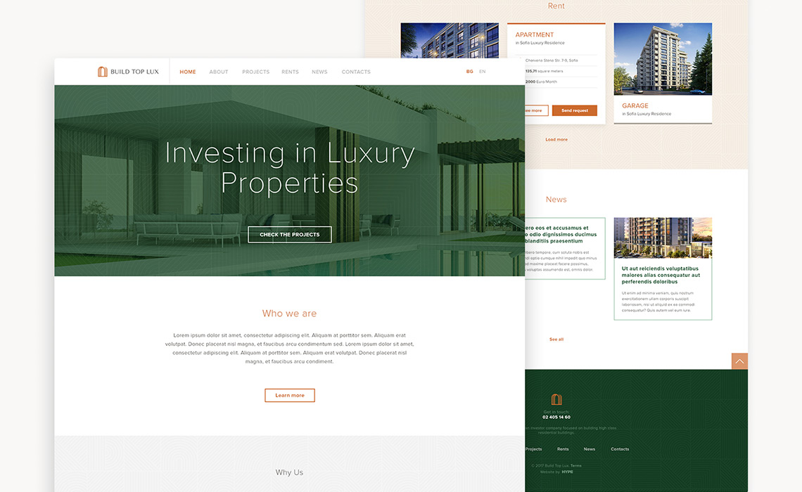
At the final stage of the project we created the online presence of the Brand – a responsive website that serves as the online hub for potential customers of the business. The website is optimized for mobile devices and clearly articulates the look and feel of the Brand Identity we designed. It adopts a number of its elements and patterns and combine them in a way that outlines the company as a leader in the commercial real estate space.
