Case Study
Belgian bank Argen-Co tasks HYPE with the delivery of a simple web experience for its senior customers
Client
Argenco is a bank, operating in the Benelux region with headquarters in Antwerp, Belgium. The bank was recently separated from Argenta – one of the oldest banks in Belgium founded in 1956. With only 66 000 shareholders, Argen-Co is a small bank, which gives it an unique family feeling.
Challenge
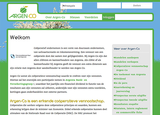
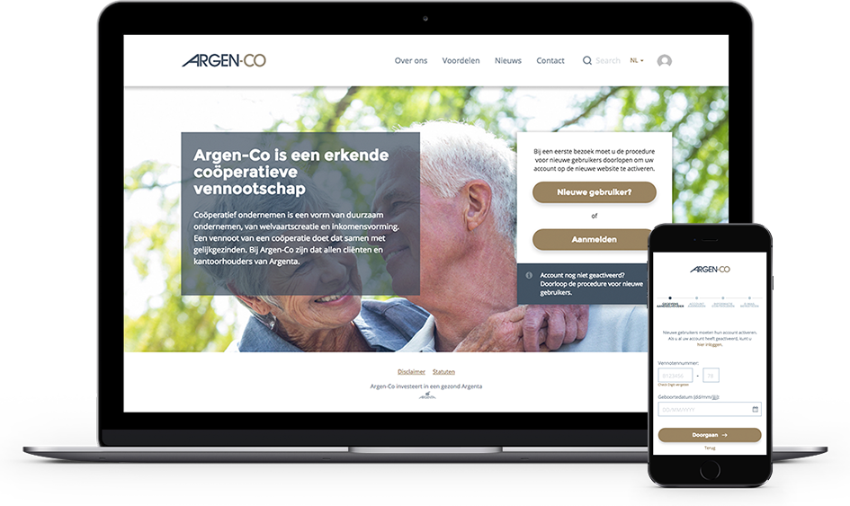
As the bank was recently separated from a bigger one – Argenta, the company needed its own look and feel which communicates their vision and values. Another goal of the redesign was to help existing stakeholders, who were mainly senior citizens, to create online accounts, check their stakes and different promotions, which they have as bank members.
Solution
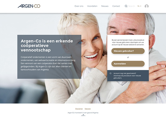
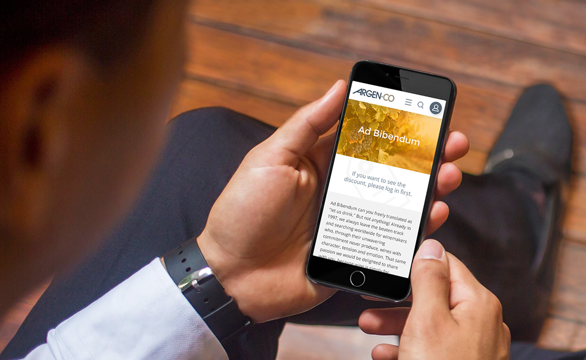
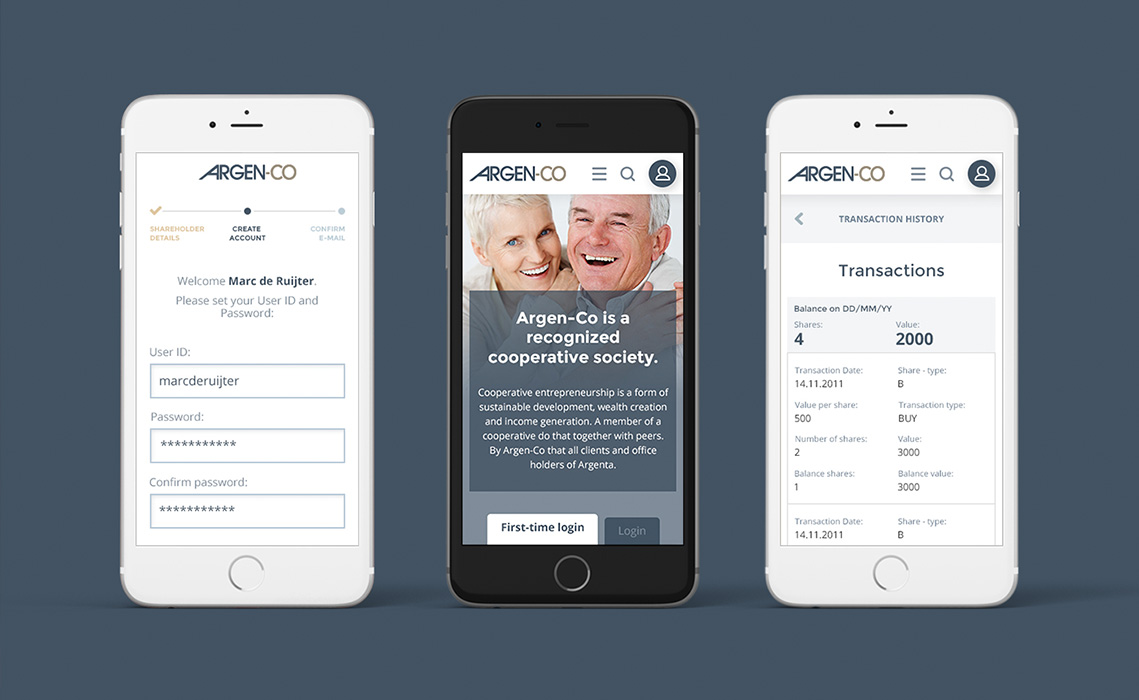
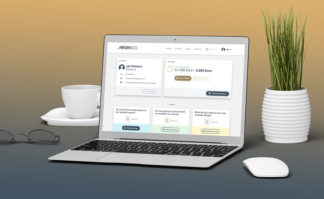
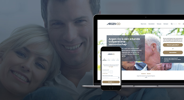
As most of the Argen-Co’s members are senior people, we had to simplify the usage of the website as much as possible. Big fonts and CTA buttons, simple navigations and optimized user flows for registration have been implemented throughout the website. Since this is a new platform for the shareholders in the bank, one of the major goals was to get every shareholder to register in the platform. Because of this we put an accent on the registration form in the homepage for the launch.
Prototype
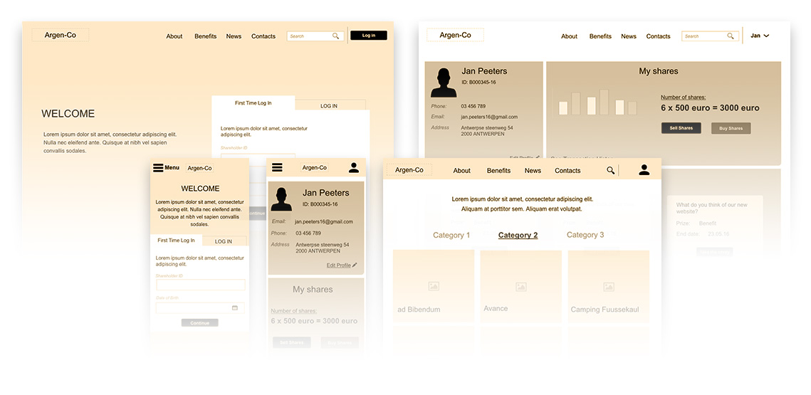
In order to decide how to simplify the registration process, we prototyped it with wireframes. Because of the limited digital knowledge of the bank members, our team wanted to put a limited required fields for registration. We ended up having only 2 fields – e-mail and stakeholder ID, which is a unique number that is physically received when someone becomes a shareholder in the bank. At the same time it’s secure and easy to use, which was another problem which we resolved with the help of prototyping.
User Interface
After agreeing on the final prototype with the client, our team of designers started working on the user interface design of the platform. Following one of the main project goals, to differentiate Argen-Co from Argenta, we created a new color scheme with pastel colors that really stands out on it’s own and establishes ArgenCo as a separate brand. Our team made use of highly contrasting colors and combined them with big typography and large elements such as buttons and form fields. The end result we got is a simple, clean and intuitive interface for the Argen-Co website.
Before & After
