It is now a fact that a well done B2B corporate branding positively influences the decision making process of your prospects, nudging the odds in your favour.
If you’re looking to quantify how much exactly, you can use the following study by McKinsey & Company as a good starting point. The survey clearly concludes that:
“B2B companies with strong brands outperform weak ones by 20 percent.”
And a huge part of branding is a company’s visual identity.
If you think about it, most of the times the first impression your business makes to a prospect client is through your logo, marketing collateral (such as print or digital stationery), or your website.
So it comes with no surprise that all successful companies have put a good amount of time in crafting their corporate branding, with nice and sharp focus on it’s visual part.
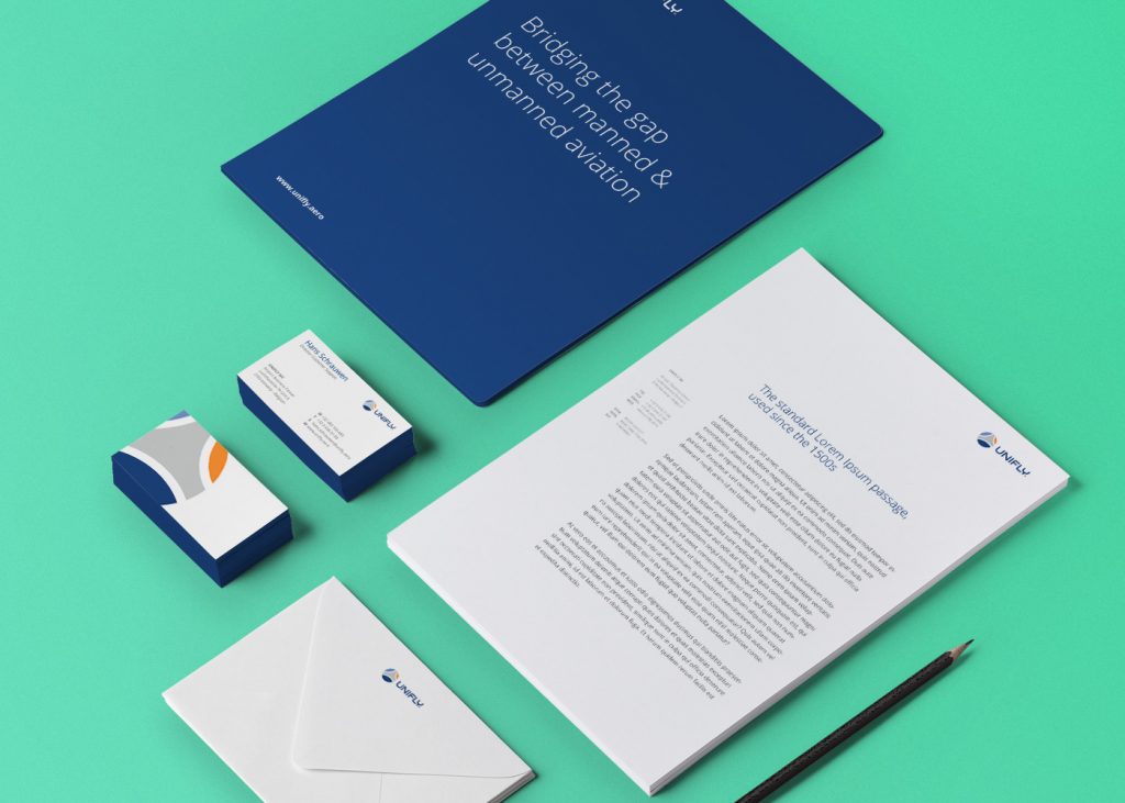
Example of corporate B2B branding package we designed for aviation software proider UniFly (see full case study).
Depending on your business, your visual identity might be comprised of many different visual elements. And if you are serious about establishing a successful brand, you need to make sure that it has unique design and a well-established set of graphic elements.
Moreover, you should make sure that all of these elements work together and have a consistent look and feel across all communication channels.
Let’s zoom in and explore the major elements that comprise a visual brand identity:
Logo
Probably the first thing your customers remember about your company is your logo. It’s usually a symbol, a stylized lettering or a combination of both.
The logo plays a role in each interaction with your customers, and it should be able to do 2 things very well:
1) Be unique and memorable to distinguish your business and make a good first impression.
2) Be easily recognizable to ensure that each interaction following the first will add to your company’s brand awareness.
To do that, good B2B logos must be clean and simple, and should match (and express) the personality of the company. In time, those qualities will guarantee your business instant recognition and trust.
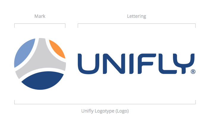
Example of a B2B logo design comprised of logo mark and lettering. Designed by our team for aviation software proider UniFly (see full case study).
Marketing Collateral
The set of branded materials (i.e. marketing collateral) you should have varies a lot depending on the business needs, but you should have at least a basic set at your disposal.
Business cards are still essential, even though we see a decline in their usage. Digital templates such as letterheads and slides for presentations are also recommended.
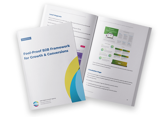
This should be enough for starters, but depending on your communication needs different kinds of brochures and flyers (both print and digital versions) might also be considered as a worthy extension of a company’s corporate branding.
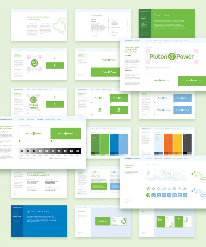
Samples of printed collateral, part of the corporate identity we designed for technology startup PlutonPower (see full case study).
Brand Guidelines
The Brand Guidelines, sometimes referred to as a Brand Book, is a document that explains how to use and apply all the different elements of your corporate branding. It’s often ignored by most companies, but it’s still the main tool that helps you maintain a brand consistency across all mediums.
In its simpler version, it includes the foundations of the brand – explanations and example usage of the logo design, together with the color palette and corporate typefaces (a.k.a. “fonts”).
In its more advanced state, It can also include different graphic elements such as illustrations, icons, photographs and so on.
Especially if you have a physical product, the brand can be further enforced with the packaging itself. Modern services like Arka offer on-demand services that make the whole process much easier.
Website
10 years ago, a lot of B2B companies didn’t even consider having a website, let alone relying on it to generate new business. But times have changed and more and more of them are starting to rely heavily on their web presence to attract customers and generate leads.
Even the smallest and simplest B2B website is actually a complex product, if created to serve as a tool for new business.
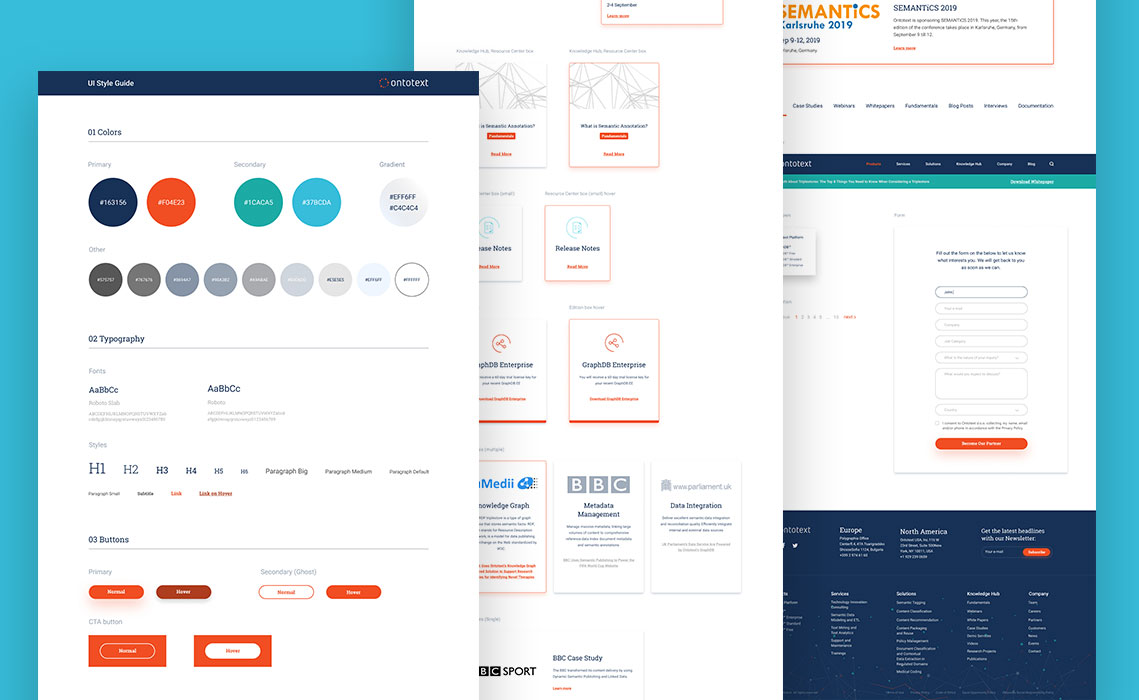
Naturally, the visual style of your website should be aligned with the Brand Guidelines of your company, serving as the digital extension of the business.
But when you go beyond just the visuals, there is a whole science behind websites that should be applied to make sure they generate business. If this subject prompts your interest, I suggest you take a look at this entry level article that describes some of the must have steps you need to take when designing a conversion website.
B2B website for SAP partner Sqilline, designed and developed by our team (see full case study).
Conclusion
We are now in the digital age. And because of the wealth of information available online, B2B customers are more independent and educated than ever and have the ability to choose when to interact with your brand.
To stay ahead of the competition, B2B companies need to take true ownership of their corporate branding and recognize the major part it plays in establishing credibility, trust and starting conversations with prospects on the right foot.

