In our previous article we told you how simple messages, unique call to action buttons, good headlines, inquiry forms and credibility are going to help you improve your website conversions. As promised, here we present you five more outstanding ways to really be effective.
Natural, easy-to-understand language
No one likes to feel stupid and you should avoid to make your customers feel this way. Best language for your website is the simple one. Forget about the fancy, long and complicated sentences. Think of people when you write and forget about the companies. People are going to read your text, so explain it like to your best friend. If there is a sentence that you will not use in a casual conversation, rephrase it. Your words should be persuasive, informative and easy to digest.
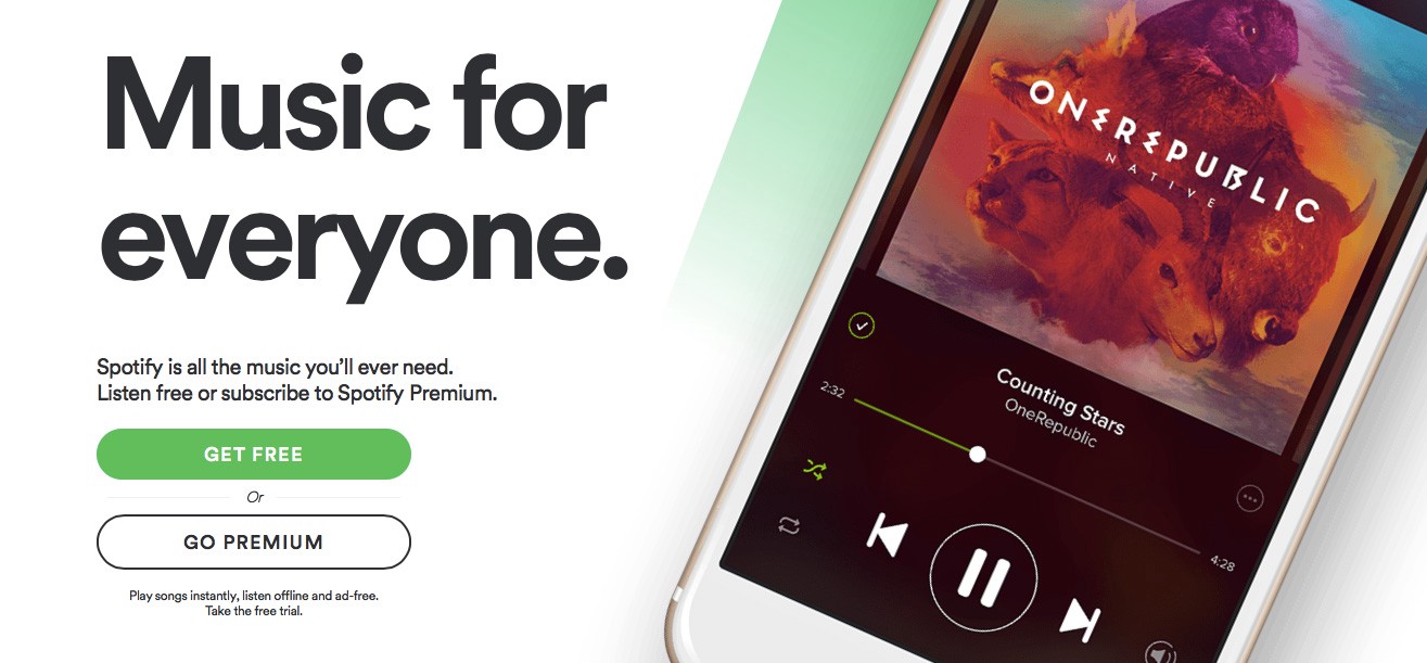
Spotify has a simple and clear message
Focus on emotionally charged language. Always tell a story — remember the story of Scheherazade. She had a pretty good incentive to make her stories engaging. If her husband was not intrigued night after night, he would have executed her the next morning. No one is going going to execute you, but people are going to leave, which kind of executes your conversions.
A good tip is to be direct. People always appreciate it. Go straight to the point, tell them exactly what will they get. It saves your time, as well.
Real Testimonials
People are sometimes very sceptical and they need proof that you are the right choice. On of the most used technique is presenting client testimonials. Using a happy picture to a great comment about you could bring in more attention. If you link this picture to a social profile, then you are really convincing. Video testimonials are highly effective because your prospects can see the emotions of your satisfied customers. Don’t you ever try to fake your testimonials. Sooner or later people will get you and then you are screwed.
Droplr displays multiple testimonials as reference
Present all the testimonials you have — great ones and not so good. It is very suspicious if everyone considers you for God. It is very smart to use a testimonial from people your customers identify with, but showing a testimonial from someone who inspires them is brilliant. Do you remember when you used to buy the same clothes like your favourite musician has? Then you know the power of a “starring” example.
Pricing
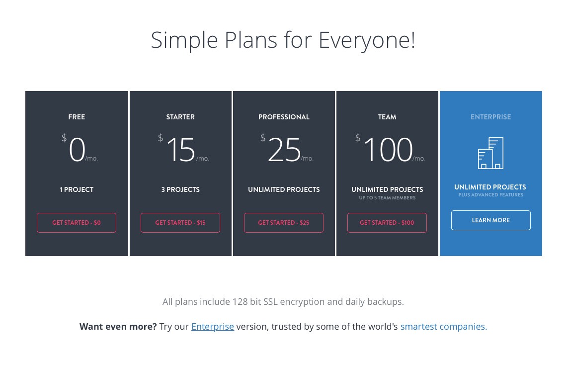
Everyone who is looking for a service or a product online wants to know the price. You, of course, have to tell them what is your pricing but you need more to boost conversion rate. Customers adore their right of choice, so you have to give them a variety of plans and let them choose. No more than three options are enough, otherwise decision making becomes too complicated and they are going to leave. As you might noticed up to now, the point is to keep the customer with you. So attract your prospects’ focus to: “Which version do I need?”, instead of “Do I need this?”.
Prototyping tool Invision shows the pricing in a clear way
Imagine the situation: the customer is already wondering which one of your options to get. Now is the moment to make things personal. Personalize your pricing plans and limit the information you present to your visitors. You don’t have to overload them with plans and products they are not going to buy anyway.
Social Media Sharing Buttons
We know you are sick of great speeches about the power of Social Media but think of a situation when a visitor is on your page just to read about your product. They have heard about you and they are curious. The fact that they are not buying technically decreases your conversion rate. However, let’s say he or she is impressed and knows someone who is looking for your solution. Then we are really sorry to talk about the power of Social Media, but a social media sharing button is the shortest way to this other source of more conversions.
Alternatively, not everyone coming to your website will be already part of your social media communities. Therefore, you can use the opportunity to convert your visitors to social media followers as well. Remember the same — there might be people who prefer to have you in their facebook rather than in their inbox.
Compare with the competition
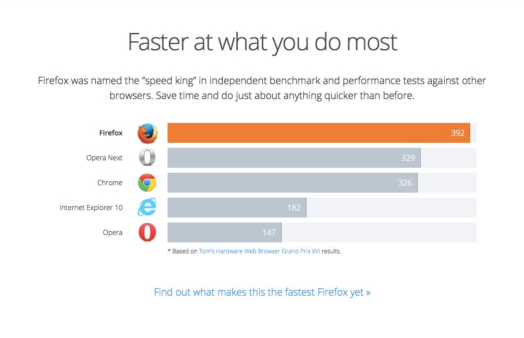
Nowadays the process of shopping involves a lot of decision making. People usually do their homework before spending money online. It hardly happens someone to buy a product without checking the competition. Unfortunately, they look for basic features to compare and usually the lower price attracts more buyers. You certainly know why you are better and what stands behind your price. Therefore, make a comparison with your competitors. It’s a double win — you present yourself the way you want the customer to see you and you prevent them from going to other websites. Do it before they do it first!
Firefox compares speed to other browsers
The easiest and most clear way to approach an effective comparison is by making a table. You should also highlight your advantages. It’s a good strategy to be objective — if you admit a drawback of yours and explain why you stress more on other customer benefits, people will appreciate it. On top of that, your words will sound more reliable.
Conclusion
Whatever you do with your website should be user oriented. A visitor’s opinion about your website usability is formed in the first few seconds on a page — your goal is to keep them there. Don’t stop testing, don’t stop trying. Take your time to understand your customers, then it will be easy to interact with them.
In case you missed the first part of this article, you can read it here.

