Let’s start with stating the obvious – your website is the storefront of your business and it represents your brand. In the B2B case however, your website is something much more – it’s a marketing tool that can bring in more clients by generating enquiries and leads.
Why is there a difference? Because making a business purchase is a responsible decision, and as such it is driven by specific challenges/needs which should be addressed.
To make sure they are best addressed, B2B buyers always do their research, no matter how thorough it is. And these days almost everyone who has access to the Internet prefers to save their time and efforts and look for their options online, landing on websites every day to evaluate possible solutions to their challenges.
There are a number of criteria based on which you can evaluate a B2B website. However, what I’d like to focus on in this post is the importance of B2B web design. It’s true that visual appeal matters a lot when it comes to design, but for B2B websites it’s not all about that fancy and abstract creative.
Yes, it should definitely be eye catching, but most of all it should easily capture buyers attention and help them with finding the right information. Here are 5 of the most important traits that a well done B2B web design should cover to do that:
1. Make a good first impression
Psychology has taught us that first impressions are essential in the process of introduction and your web design dictates the first impression that buyers get from your brand. Why is this important? If you take a closer look at even a few usability studies, you’ll see that they all confirm that positively primed users rate a product highly, even when they fail in their tasks.
If you apply this conclusion to B2B websites, this basically says that your web visitors will be instantly satisfied (or “primed”) if their first impression is pleasant, which in turn means that future purchases and interactions highly depend on it.
2. Enhance call-to-actions and improve lead generation
Using your website as a source from which you can generate leads is extremely important, and your web design can really make a difference here. It should properly underline the website’s primary CTA, making it clear to visitors on what is the expected end goal you want them to accomplish (even subconsciously). Here’s an example study by Hubspot showing how changing the design of your primary CTA can result in 21% conversion boost.
It should also clearly outline secondary CTA’s (such as view case study, learn more about a services/products, etc.) to cater to the needs of visitors that are still not ready to convert. In such a case, secondary CTA’s ensure a smooth website flow, nurturing prospects towards the desired end goal.
3. Add to the authenticity and credibility of the company
Authenticity, and its allied traits of trust and credibility, have always been one of the most important checkpoints on the agenda of B2B buyers. A tangible driver of revenues. And according to Stanford’s Web Credibility Research,
75% of users stated that they are deciding on a company’s credibility based on their web design.
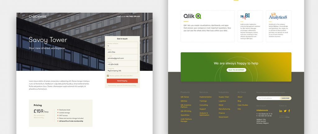
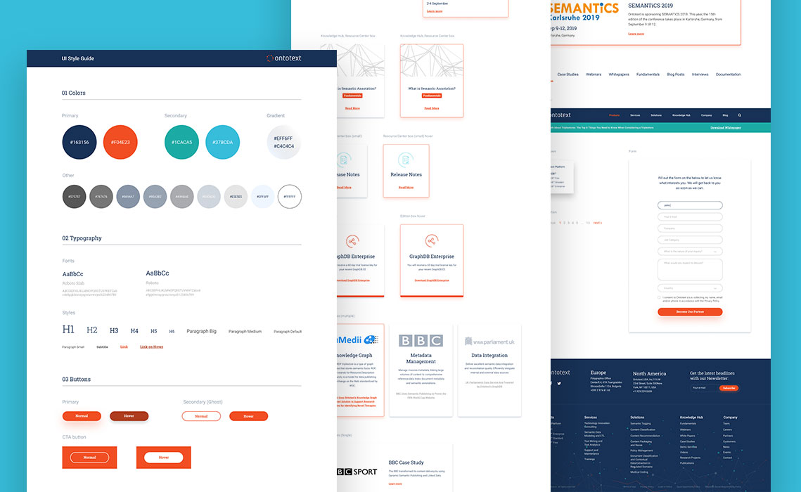
B2B web design should be clean, simple, straightforward and without unnecessary decorations. It should clearly focus on content and CTAs, and show that the website is functioning and kept up to date.
HINT: If you’re looking for additional tips on how to improve your website in this aspect, make sure to take a look at another one of our posts that focus on various ways to improve the credibility of your B2B website.
4. Be optimized for mobile devices
This one should go without saying, but just in case – having a mobile responsive website is a must, as the number of people accessing websites from a tablet or a smartphone is constantly growing. Sure, it takes time to think this through and rearrange your design accordingly, but not doing it can cost you precious leads which is always bad for business.
If you’re not convinced that optimizing for mobile devices is important, you should definitely think twice about it and read more about the reasons of why your website should have a responsive web design.
5. Focus on User Experience
One of the primary purposes of B2B websites is to educate, which usually raise the issue of (1) how much content should you have on your website and (2) how to best structure it. While the former is most often a challenge tackled by Marketeers and their expertise, the later falls completely into the domain of designers.
Good web design is not concerned only with the visual part of the website, but also with it’s structure, layout and the overall user experience. User should be able to easily find information not only about your company and it’s offering, but also supporting content such as process explanations, detailed features, pricing, documentation, etc. Of course, this should all be intertwined in way that ensures the smooth flow of information and eliminates friction.
How to do that? Focus your efforts on designing a clean and simple sitemap and smooth user flows. Once you have those figured out, don’t jump straight to the visual part of the design. Invest time in creating wireframes that can be easily edited and experimented with, so you can test out your assumptions with real users and improve based on their feedback.
Conclusion
Web design plays a major part in helping you make a good first impression, establish trust and credibility, and nudge prospects towards the desired action that will help you start a conversation.
Underestimating its importance can prevent you from using your website as the powerful sales and marketing tool it can be, forcing you to leave business on the table without even realizing it.


