In our latest eBook “Essential Guide to Website Redesign for Marketers” we help marketers understand the process of website design better, so they can steer their website redesign projects through the right stages. This way they can ensure their website is better able to engage visitors and achieve the desired business goals.
One of those key stages are Design and Development. Here is where your idea materializes. In this article we’ll dive deeper and explain what are some of the best practices for creating effective and engaging online experience for your prospects.
Step 1: Set the Scene with Information Architecture
The activities related to Information Architecture (IA) help you create the structure of the website, so you can understand what information you need to make available depending on where the user is on your website.
Here are some of the most common Information Architecture deliverables:
- Content Inventory and Organization: A detailed and organized list of all the current content on the website, and future content to be introduced with the redesign. Planning and creating your content early in the process enables the design and development teams to create the best possible product.
- Site Map: A visual that documents all pages and page types on the website, together with the paths that users must take to reach a certain page. This provides a bird’s eye view of all the pages in the website, and the hierarchy between pages.
- User Flows and Scenarios: A visual that shows the steps and actions a user must take in order to achieve a certain goal on the website. These types of deliverables are really useful when dealing with more complex functionalities on your website.
Examples of a Site map (on the left) showing all pages and short outline for each page, and User Flows (on the right) showing the steps a user would take to complete an action.
The easier it is for your users to find what they are looking for on your website, the better your IA is. The IA should be perfectly aligned with the mission and purpose of the website, but you also need to consider the goals of the end users. The organization of the content should enable your users to accomplish their goals, and meet their expectations as defined in your user personas earlier.
Step 2: Tell a Story with Wireframes
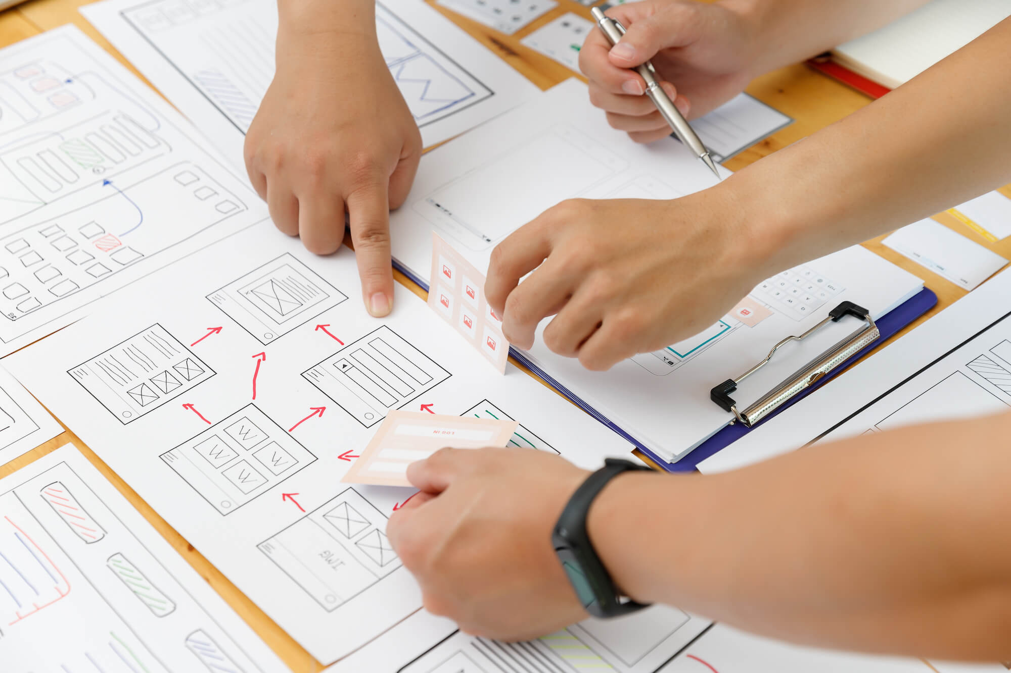
After you have all the content ready and structured in the right way, it’s time to think about how to arrange all of the information on the pages of the website. The wireframes are the blueprint for the upcoming visual design. The purpose of the wireframes is to bring together the main elements of the website: the content, the navigation, and all the interaction elements such as buttons and forms on each page. The wireframes should not incorporate any visual designs, graphic or branding elements.
Using only text and simple shapes (without any color or style), you can collaborate on the initial layout of each page of the website.
Wireframes are the best way to convey how the information on each page is structured and organized. Also, wireframes are an easy and quick method for you to align all decision makers around the structure of your website and the connections between each page.
Step 3: Explore the visual design with Mockups
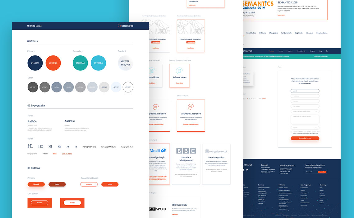
Using your wireframes as a foundation, web designers create the full graphic composition (also referred to as “mockups”) for all the pages in the website. The idea of the mockup is to include all visual styles and elements, so that you can agree on how the final website will look and feel.
The mockups show the layout of each page, the typography (fonts), the images and graphics for all elements on each page exactly as they should look on the final working website. Note that similar to wireframes, mockups are static and are not meant to demonstrate any functionality.
Using mockups, the final look and feel is laid out for each page. They include the final fonts, images, colors and visual styles of all elements as they should appear on the actual website.
In many cases, mockups are the final step before the start of the development. Front-end developers use the mockups as a reference to create the HTML & CSS code for each page. Having a finalize design before coding starts can save you a lot of headaches and money from having to redo things that are already coded.
Step 4: Test the User Experience with Prototypes
Sometimes it’s hard to imagine the final website by looking only at documentation, or even mockups of the final designs. Prototypes are the closest thing you can get to a working website, before actually doing any coding and development.
Unlike the static wireframes and mockups, a prototype is a functional deliverable. This means that a user can interact with a prototype by clicking on the links, buttons and other elements that trigger behaviour on your website.
With interactive (clickable) prototypes, you can easily test the website internally with your team, or even with some of your potential users or customers. Prototype by Stoyan Daskaloff.
A big benefit of creating prototypes is that you can conduct user tests early in the redesign process. This helps identify flaws and make quick and easy improvements, before any actual development commences. Also, you can set up a prototype really fast. Some of the most popular tools for prototyping are InVision and UXPin, which are easy to use and can get you great results.
Step 5: Get Development on Board
An important aspect of development to understand is that there are always multiple solutions for a single problem. Depending on your individual project and the developers you are working with, the approach and solutions will vary. But you can make sure the outcome is what you are looking for, by setting aside sufficient time to explain the business goals and requirements of the project to everyone in the development team, not just the project manager.
If possible, schedule regular meetings with the development team (in person or online) to discuss project details and overall progress.
The more context everyone involved has about the solution they are building, the better the result. For the time of the project, try to include the developers as part of your team. Schedule regular updates (once or twice a week), where you discuss the progress, issues and next steps.


