Case Study
Redesigning a leading recruitment agency website to align it with aggressive growth plans
Client
HRS is the leading recruitment agency in Bulgaria providing integrated employee management services. CocaCola, KFC, Danone, Shell, Pepsi, Telus and many other internationally well-known brands consider HRS as their preferred partner for recruitment, temporary staffing, payroll administration and all types of HR solutions.
Challenge
Throughout the years HRS`s website has become an online hub for B2B buyers and Job Seekers alike. And although this influenced positively the online visibility of the company, it also presented it with the challenge of figuring out how to serve both fractions of the visitor flow with relevant information. A lot of questions came up. How to best structure the architecture of the website to accommodate the two separate flows? How to intertwine the flows to ensure the very best of user experience? What is the best way to structure the call-to-actions to ensure high conversions? How should the functionality of the website be extended?
Solution
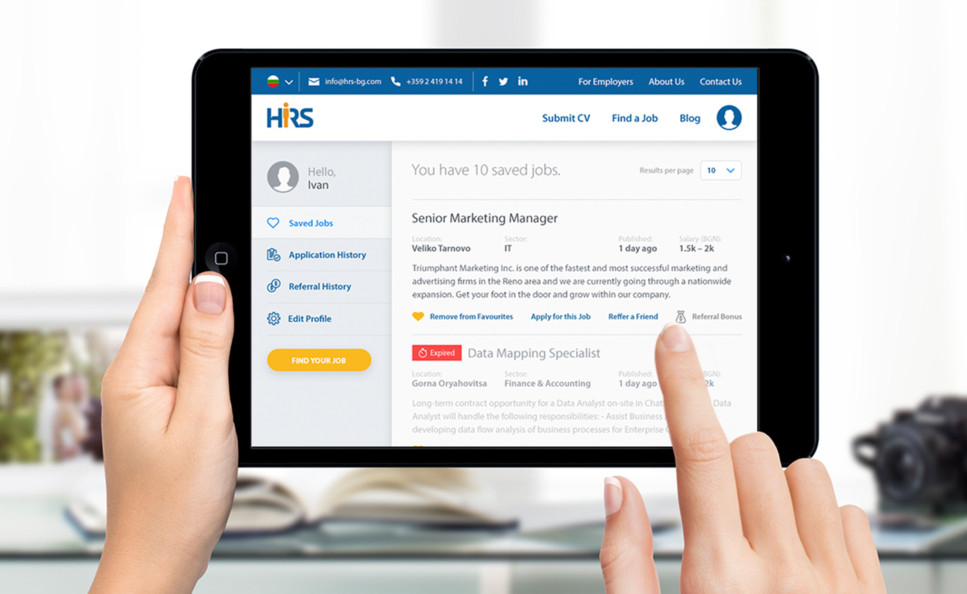
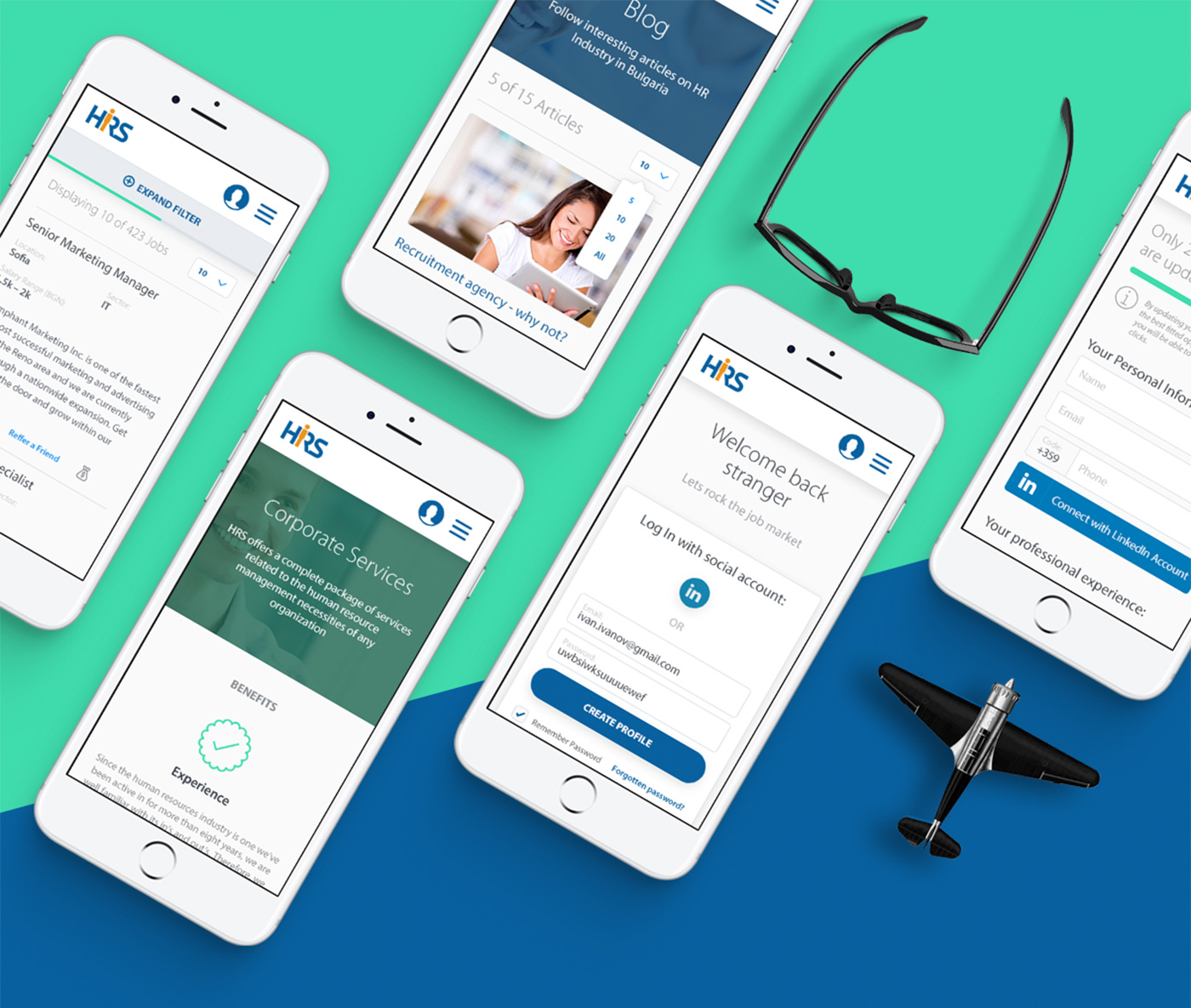
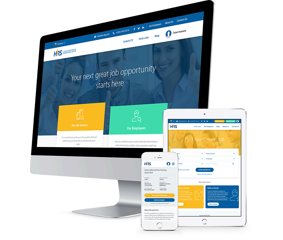
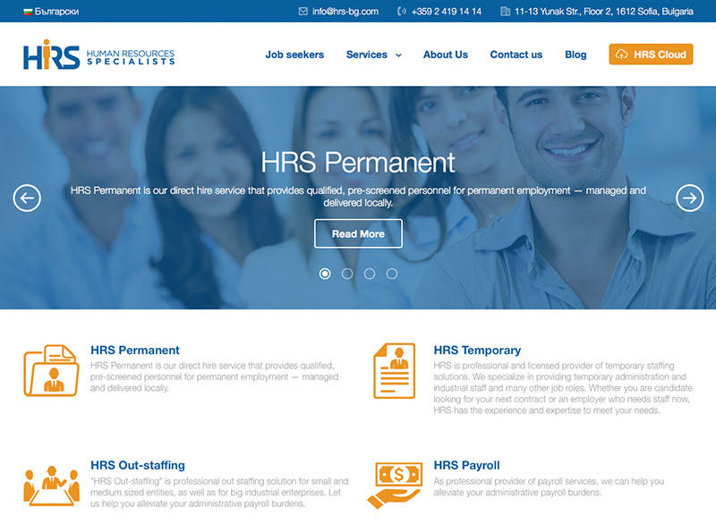
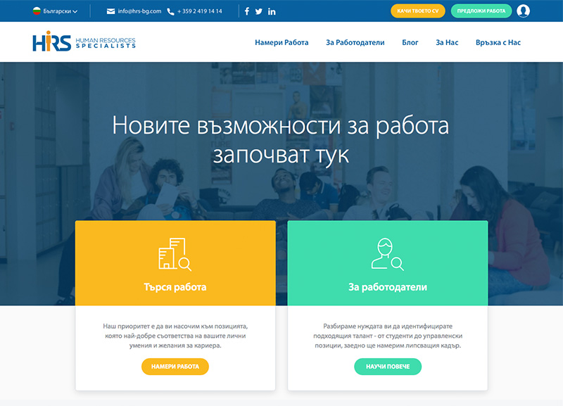
Since we knew this won’t be the typical B2B website, we included our digital strategists right from the start to make sure that we have a sound strategy in place before even thinking about wireframing the new website. With their help we narrowed down the most important steps in each persona’s customer journey and used this insight to draft the initial prototype of the platform. We involved a group of users early on in the process to test it and through multiple iterations, our UX designers were able to finalize the concept and ensure the smooth user experience we were aiming for. From there it was easy for our UI team to draft a clean and beautiful design for each page of the website that can be transferred to the technical team for implementation. The result is a responsive web platform that neatly accommodates the two main visitor flows – for B2B buyers and Job Seekers – and clearly outlines HRS’s business offerings, while also rivaling the functionality of the existing job portals on the market.
Before & After
Discovery
We started by identifying the website personas and making sure that both teams are clear on who those people are. We focused on their most pressing pains and pinpointed the informational needs that should be covered. We then used the personas as a stepping stone to create detailed customer journeys and map out areas of opportunity that we have with the website to improve the customer journey of visitors. The result was a huge list of ideas about specific resources, pages, section and functionalities that can be incorporated into the new website to make sure we accommodate the needs of each persona. Having those in place, we assembled all the insight gathered through our thorough discovery and prioritized the items for the initial launch. We penciled down the scope of the new website and laid out its information architecture. At the final stage of the Discovery phase, we created a scorecard with metrics that will help us measure the success of the project.
Prototype
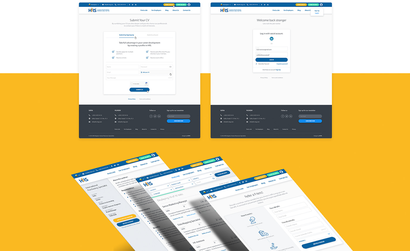
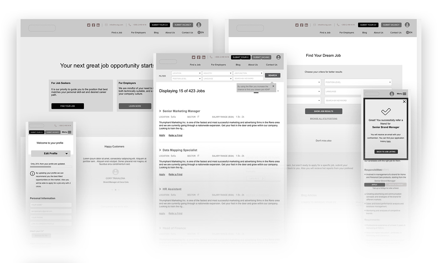
Superior user experience was one of the main requirements, so we had to make sure that all information on the website is well-arranged and all steps of each visitor flow are clear. To make this happen, our UX designers developed detailed wireframes for each screen of the website including marketing pages, user’s profile, job listing and sign in/up flows. Each page was designed for desktop, tablet and mobile to ensure the superior user experience regardless of the device you’re using to access the site. Once the wireframes were complete, our UX team and the stakeholders from the client’s side decided to run a moderated usability test with real users to confirm the flows before diving into the design and development phases. The final deliverable of the phase was an interactive prototype in three responsive states that is clickable and behaves like an implemented solution.
Visual Design
Based on the client’s preferences and our own desk research, we decided to create the design based on Google’s Material Design guidelines. We combined a simple, intuitive and predictable design approach to present large volume of content. As always, both our UX and Design teams sat together and tough about each micro interaction during the visitor flows to ensure great experience for both personas. The resulting design underlines the most important elements in each page and pushes visitors one step further in their evaluation journey.
