The pricing (a.k.a. editions) page is among the most important pages on your website. If your website has such a page, it is very likely that it ranks among the top 3 most visited.
In fact, when purchasing online, B2B buyers rate pricing as the most useful information. Technical information and specifications are the next-most important topic.
(V3B Blog)
What this means is that the opportunity to sway a purchasing decision towards a certain edition or type of product no longer lies only in the hands of your salespeople. You need to construct your pricing pages in way to match your business goals and direct people in the desired direction.
Below is a list of 5 techniques derived from psychology that will help you create a more effective pricing page.
1. Anchoring
Anchoring in psychology refers to the tendency to rely on the first piece of information you encounter as the basis for making decisions. Anchoring is probably one of the most used techniques when creating and presenting pricing information both online and offline.
The Misconception: You rationally analyze all factors before making a choice or determining value.
The Truth: Your first perception lingers in your mind, affecting later perceptions and decisions.David McRaney (Anchoring Effect)
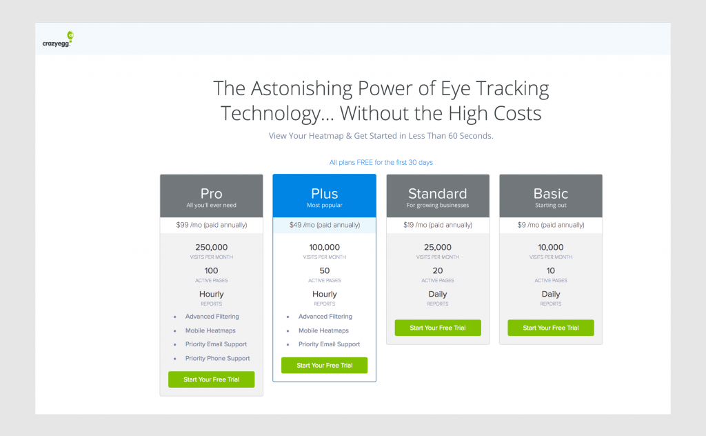
The way you can apply this to your pricing page is to put your most expensive edition on the left of your page. Since users read pages from left to right this will be the first price they see, thus it will be the basis against which they will compare all other editions.
CrazyEgg’s pricing page is one good example of this practice being employed:
2. Decoy Pricing
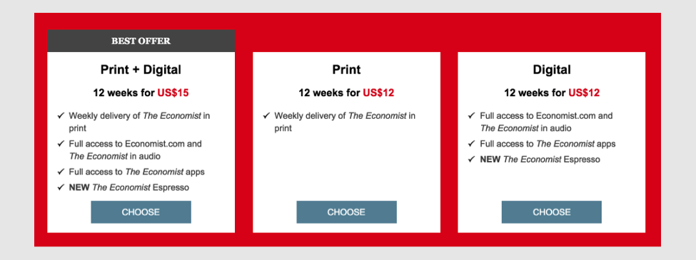
Decoy pricing is the practice of creating a product option that looks less attractive with the goal of pushing customers towards a more expensive option. For this approach to work you need to price the less attractive option not much lower that the more expensive option, but you need to include much less value in it.
A great example of this practice are online magazines which also have a print edition. Here is an example from the Economist.
Notice how close the price of the individual Print and Digital subscriptions is to the combined subscription. Obviously, in this case the company bets that most people would prefer to have both print and digital editions for a slightly bigger price
3. Bandwagon Effect
In psychology the Bandwagon Effect term is used to qualify cases where people do certain things because other people are doing them. This is a powerful technique which can greatly influence the purchasing decision of online customers.
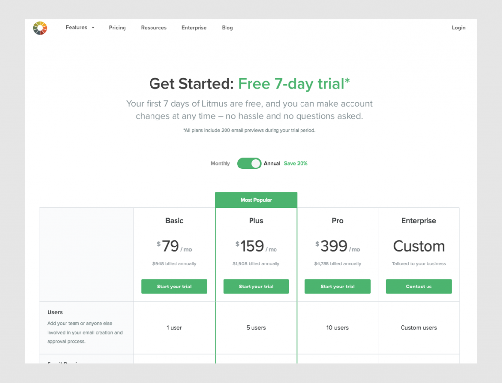
Here is one good example coming from email testing service Litmus.
By indicating which is the most preferred edition they are intentionally pushing the buyer decision towards this option.
4. Social Proof
Providing social proof is one of the most effective techniques for reducing buyer anxiety. Social proofs demonstrate that real people use your product and that it brought them value. One of the most popular forms of social proof is the testimonial.
One of the best places to share quotes from happy customers is your pricing page. But, make sure you include high-quality photos of the persona along with each testimonial. This way you will make them feel more authentic
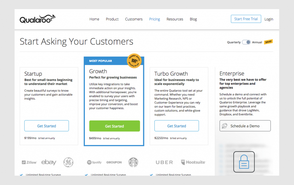
Here is a great example from analytics platform Qualaroo:
If you have the budget for tooling like Demanbase, a good approach for increasing the effect of testimonials is to personalize them depending on the industry the visitor is coming from. For example, if someone works in the financial sector she will see testimonials from clients in the same industry.
5. Reassurance
Another great technique for reducing anxiety and friction during the review of pricing information is to provide some form of reassurance during this stage.
Some elements to consider adding are:
- Money Back Guarantee Information (if you have such a policy)
- Secure Payments Information
- Data Privacy Information
- Customer Support Number
Here is an example again from analytics tool Qualaroo:
Conclusion
With the increasing digitization of the buyer journey you need to start treating your website as an extension of your sales team. Its structure and design need to be carefully constructed to effectively nudge your prospects towards the next step in their journey to becoming your customers.

