Case Study
Designing the brand identity, website and mobile app for home automation startup

Client
PlutonPower is a slovenian technology startup focusing on home automation. They designed and produced a Smart circuit breaker, which let’s you remotely control and monitor all of your home appliances without them being “smart”. A breakthrough product considered to be the most affordable solution for home automation and energy management.
Challenge
PlutonPower’s team had quite a few challenges that needed tackling. They believed that their branding didn’t reflect how high-tech and innovative their product really was. Their online presence consisted only of a single landing page that served as a pitch presentation in front of early adopters and investors. And finally, they needed to create a mobile app that communicates with their product and deliver on the benefits it promises.
Solution
We went through a rigorous discovery phase, diving deep into the benefits that come from this innovative technology. We had to align on it’s positioning, benefits, the people we’re targeting and possible ways to reach them. Once we got on the same page, we went ahead and redesigned the brand identity of the company including the logo, print and stationery objects. With the branding in place, we kicked off 2 separate sprint tracks. One was focused on the design of the new Website that serves as the foundation of the company’s communication efforts, as well as serving the end goal of converting visitors to customers. The other sprint aimed at creating the concept and design of the Mobile App that brings it all together and allows users to tap into the benefits of the product.
Branding
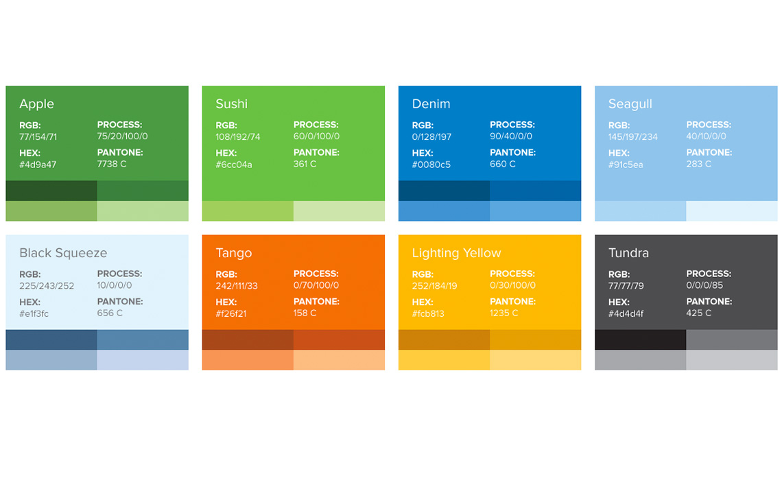
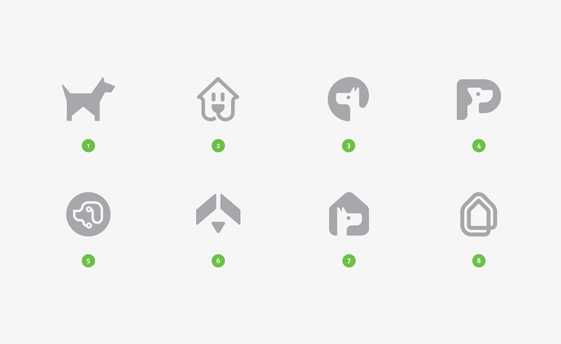
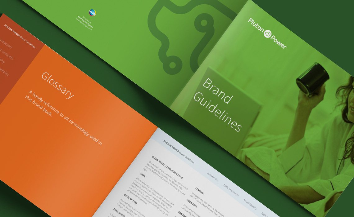
The PlutonPower team had a clear idea about the symbol of their logo – a watch dog that looks after your home. We liked the idea immediately and did a wide range of logo explorations to start narrowing down options. One of the options our branding team explored was combining the shape of a dog’s head with the look of a circuit board. This concept seemed to resonate best with the product and went on to become the winner. As with any of our branding projects, we worked closely with the client to nail down the corporate color palettes, pick equally good typography and include a selection of illustration styles. We also created a detailed Brand Guideline, which captures and explains the design and branding artefacts that were created, together with advices on usage. The brand book offers a solid foundation to sustain the consistent look and feel of the brand in the future.

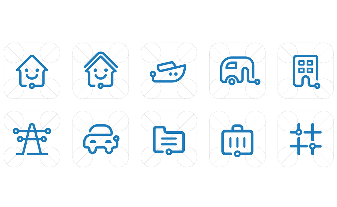
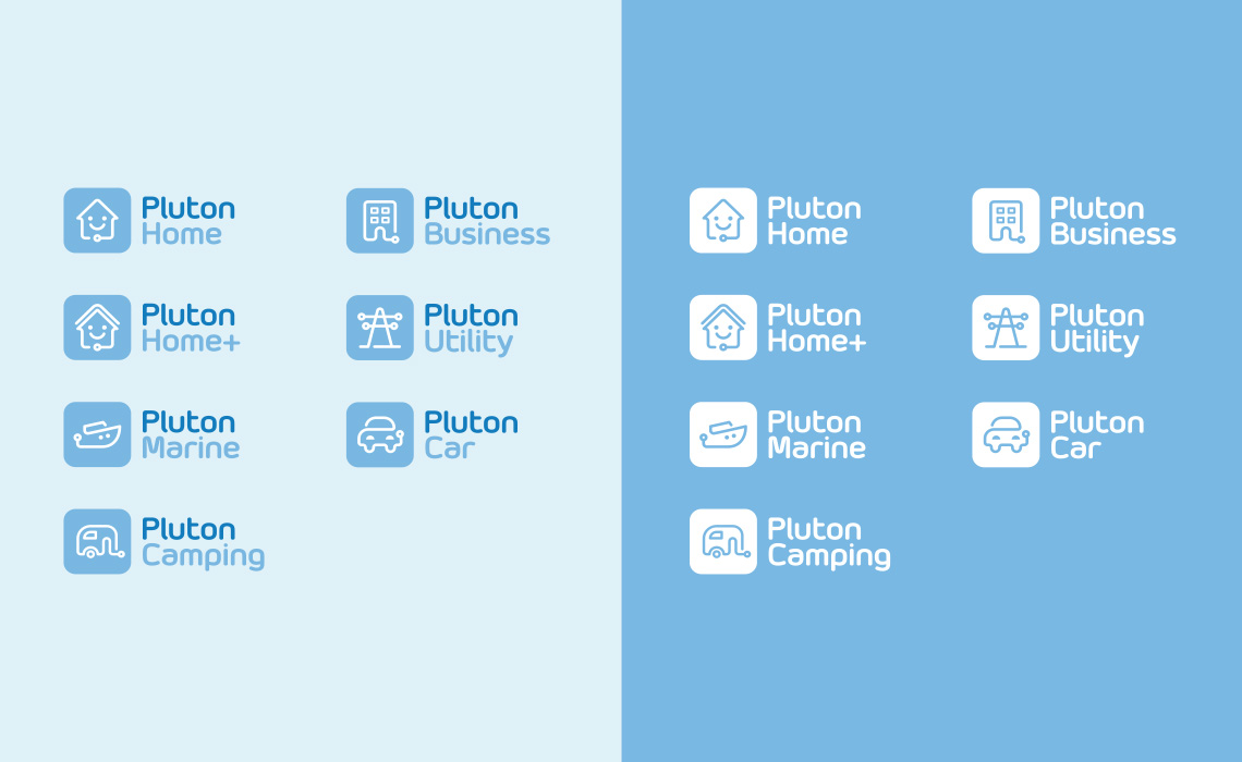
Product logos, Icons and Illustrations
Together with the logo for the main brand, our team designed separate logos for each product: PlutonHome, PlutonMarine, PlutonCamping, PlutonBusiness, PlutonUtility and PlutonCar. We used the blue color scheme to separate the products from the main brand. To enrich the visual assets collection, we also designed several icons and illustrations which were used throughout all digital and print branding elements.
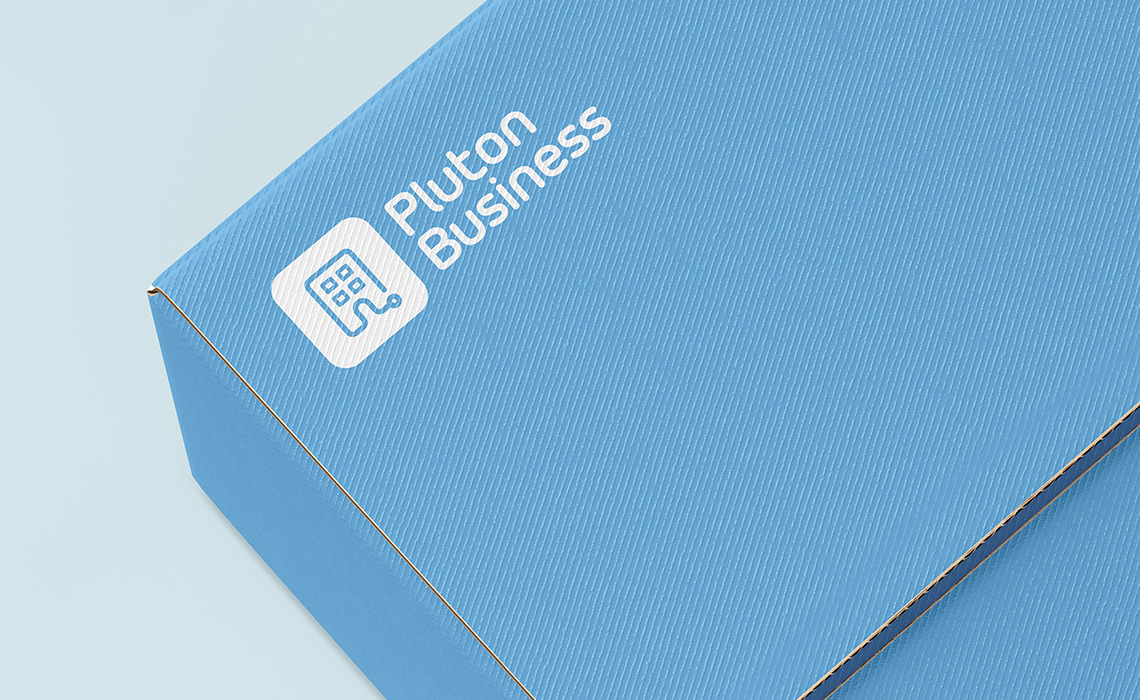
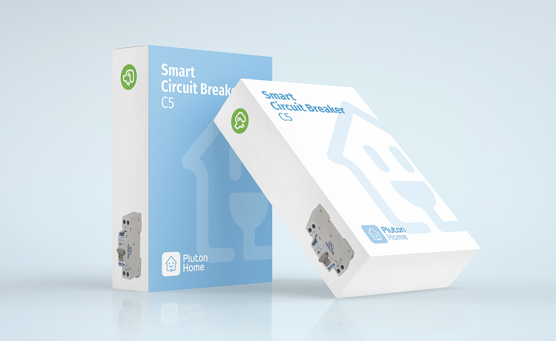
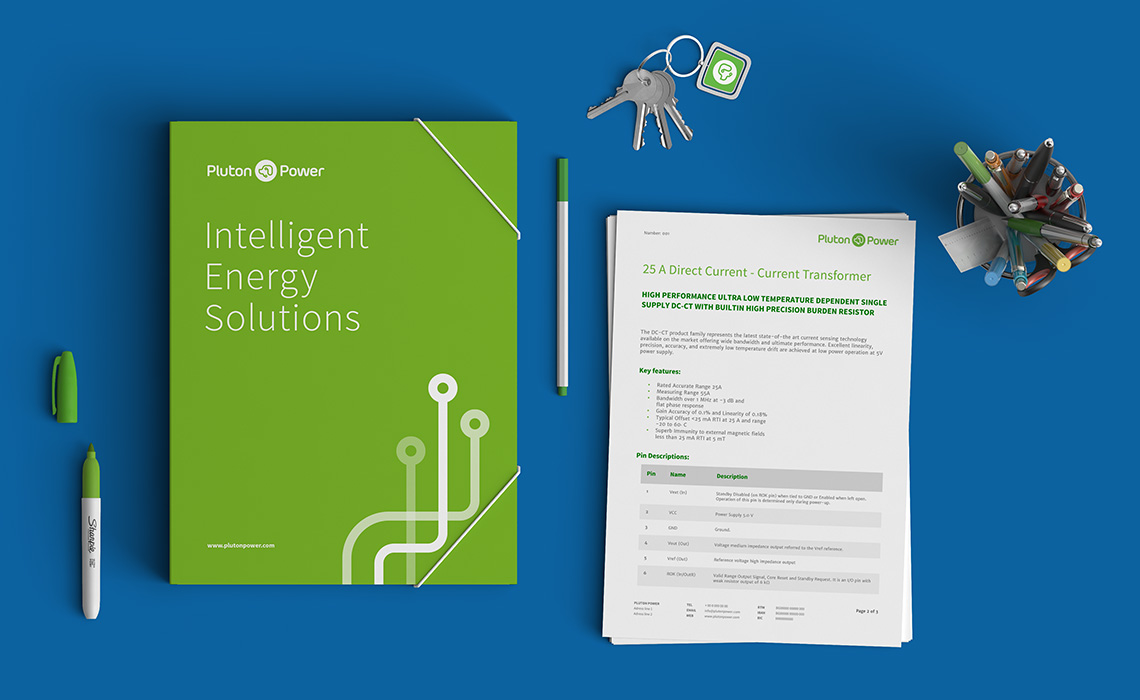
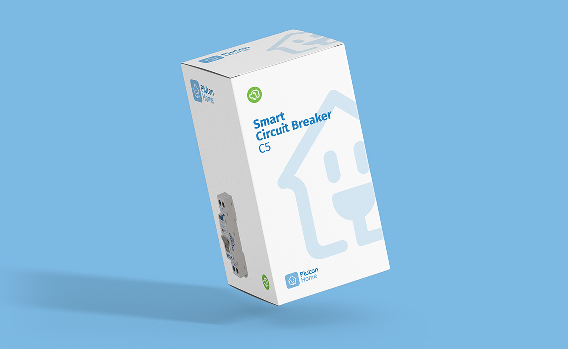
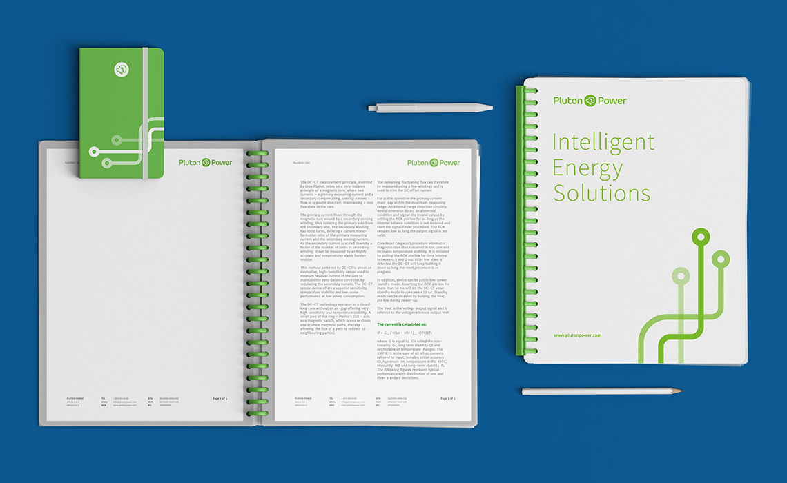
Packaging and Stationery Concepts
Concepts for product boxing and a package of stationery were also created. The stationary included various document folders, letterhead templates and notebooks.
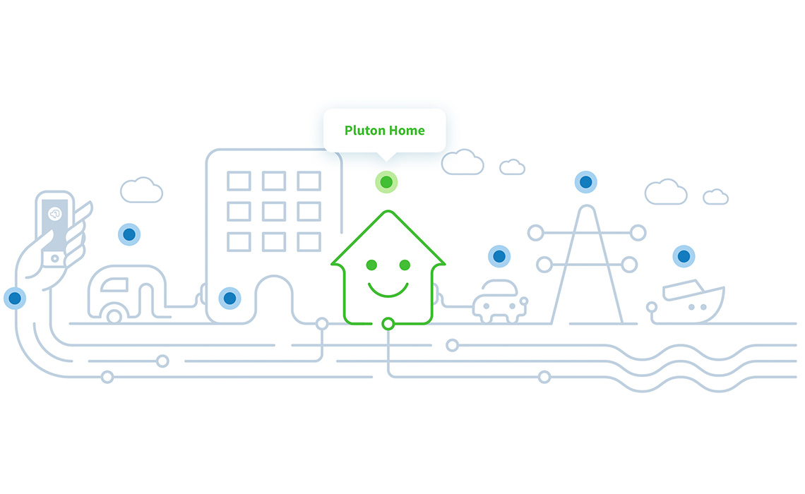
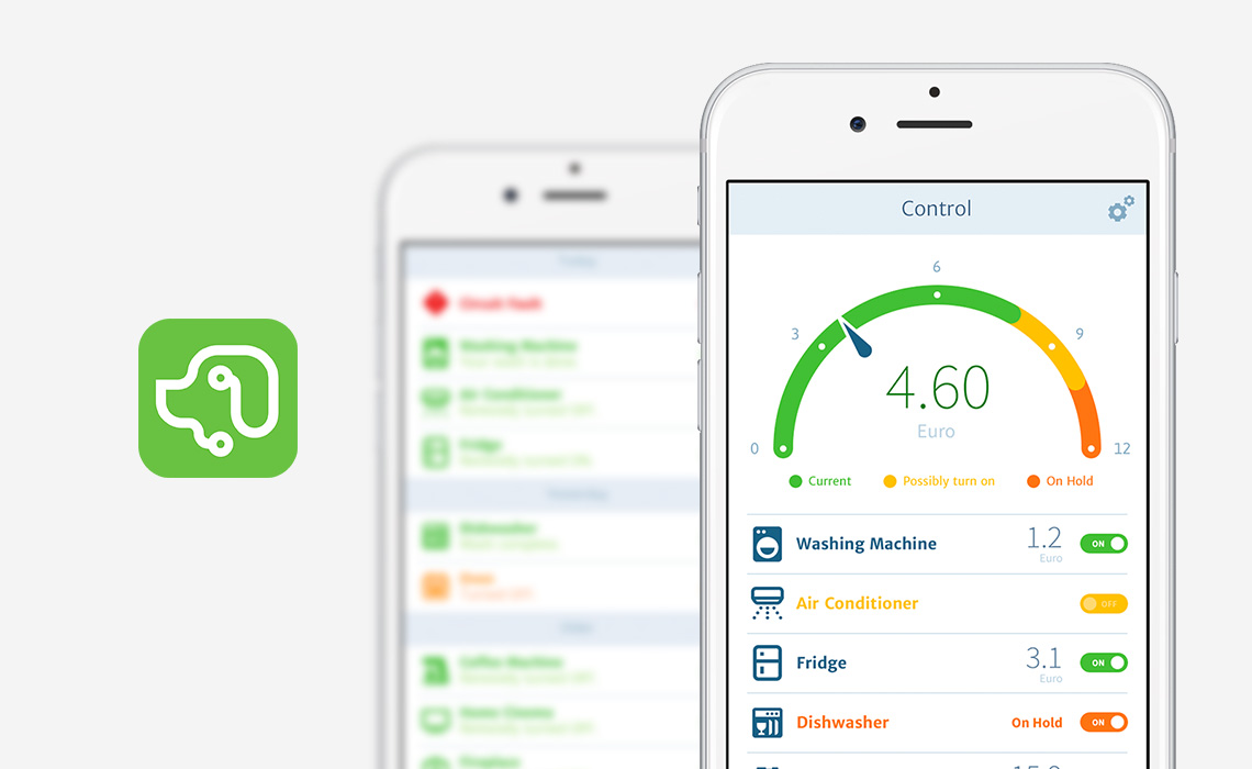
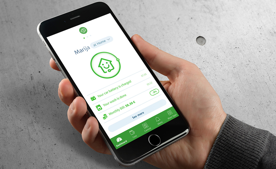
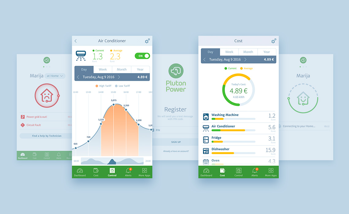
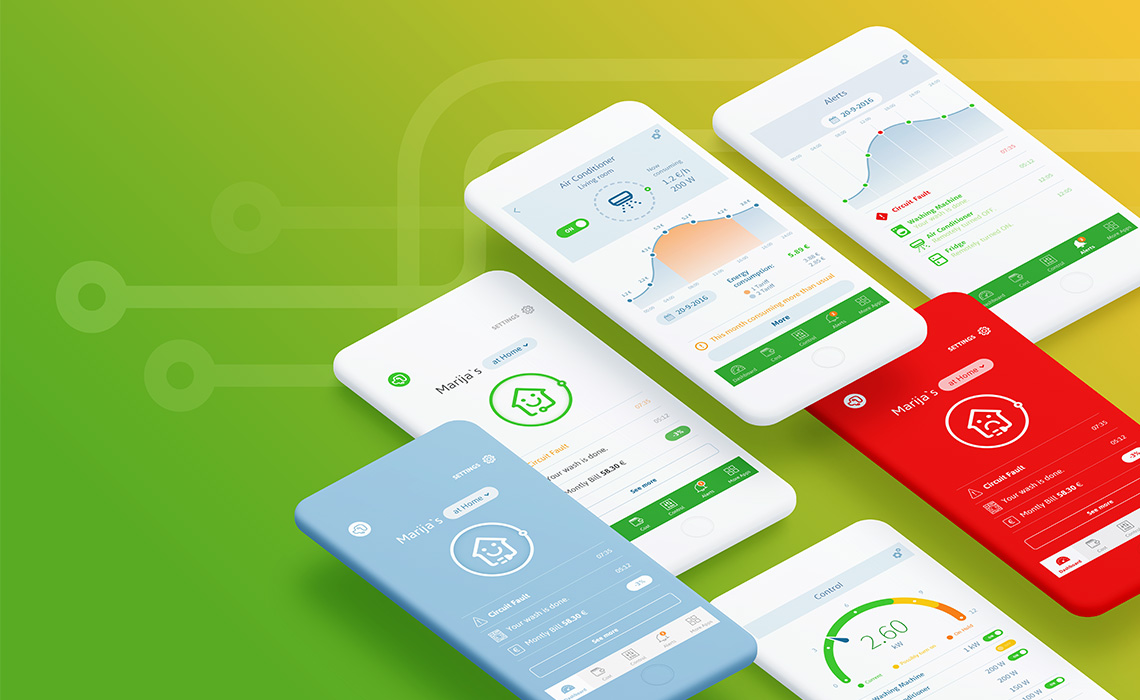
Mobile App
We also created a native mobile app that empowers people to control their entire home using the Smart circuit breaker. The app let’s you connect remotely to your home and turn on/off separate appliances, track your consumption, get alerts and also view precise energy cost calculation.
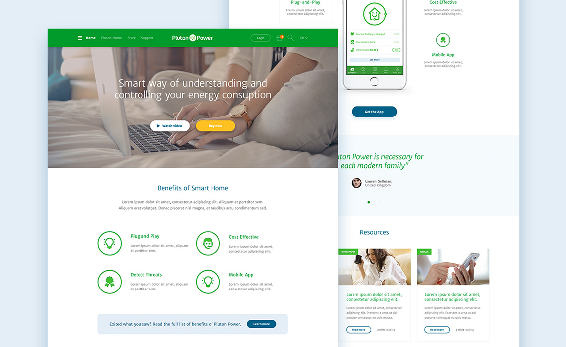
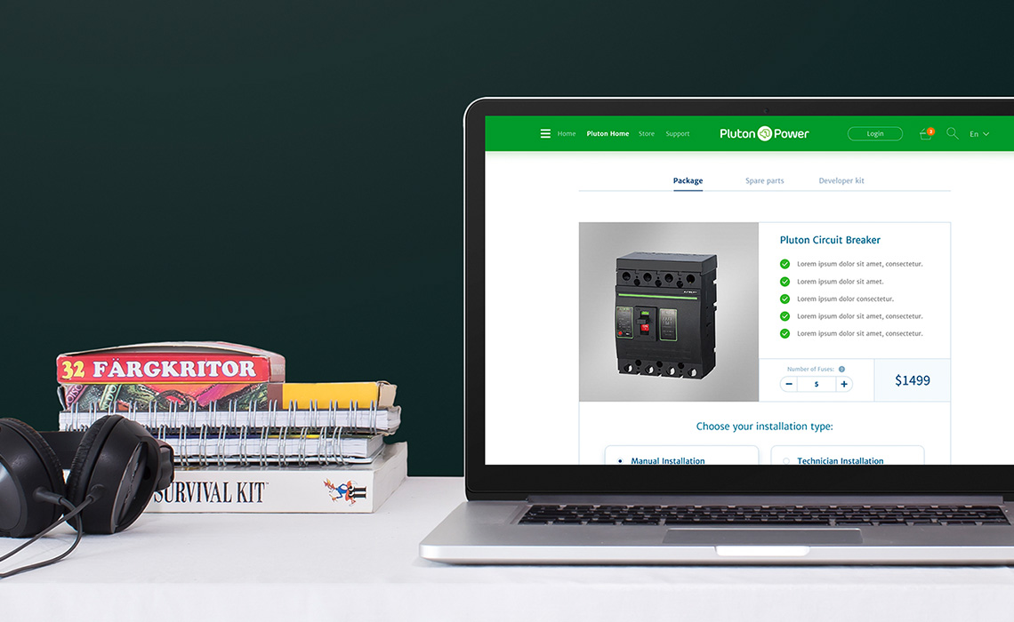
Website
Finally, we designed a custom corporate website that showcase the PlutonPower brand and it’s various products. To ensure a smooth purchase flow, we created a custom purchase and checkout process. The UI design of the website inherited the visual direction from the corporate and product branding created beforehand, ensuring a coherent look and feel of the brand across all mediums.